
 ON THE NAMING OF FONTS
 ON THE NAMING OF FONTS
Do you have a formula for naming typefaces, Nick?
Not really, Nick. Whatever sticks. I’m always looking for a new twist.

Beaufort, then, after the cheese?
That was actually “in the hood” as I lived on Beaufort Road in Toronto at the time. It’s also a good strong name! I was quite insulted when it wasn’t acknowledged by the app Font or Cheese?
I had originally intended to call it “Marlowe,” after the playwright and private eye, but that was already taken by several free fonts. Very annoying—you spend ages coming up with a really good name, only to discover that an unprofessional freebie already has it. Speaking of freebies, Bellefair, for Google Fonts, was also inspired by a street, or more precisely an Avenue, in the Beaches. Notably, it has the same semantic structure as Beaufort, from which it’s derived.
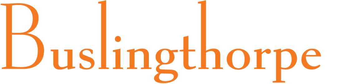
Who or where is Buslingthorpe?
That’s a district of Leeds, near where I used to live in the 1970s— it has half the alphabet, with no repeats (an isogram), the kind of word-play trivia I tend to remember, so it became a font name forty years later. Buslingthorpe: a good long word to show off the letters of the alphabet, a specimen of sorts, with both ascenders and descenders, hamburgefonts-ish.

Who are some of the people you’ve named fonts after?
Myself, of course! Well, perhaps not of course, as not many type designers do that. Apart from modesty, I suspect it’s because you don’t know whether the design in question is going to be a hit, and you don’t want to attach your name to something that might end up being one of your lesser efforts. However, when I designed Shinn Sans in the mid 1980s, I thought it would be my last type design, as I’d been trying, without success, to break into the business for many years; also, there were very few humanist sans faces at the time, so it was an allusion to Gill Sans. Little did I know that digital fonts were just around the corner and I’d soon be designing dozens more typefaces. For Shinn Gothic, I must admit I was at a loose end, so fell back on using my own name.

Isn’t Nicholas named after you as well?
And old Nicolas Ienson, as it’s a Jenson revival. Actually, Nicholas is the headline version of Goodchild, which came first, with my mother’s maiden name—and the implication that it was a worthy descendant of the original; then when I decided to do a 1970s-style version for headlines, I got the two-Nicks idea, which was too much of a coincidence to ignore.

Why Pratt Nova?
After the art director who commissioned it for The Globe and Mail, David Pratt. I recalled that Frederic Goudy had mentioned, in his book Goudy’s Type Designs, that he had named Kennerley after publisher Mitchell Kennerley, who had commissioned that face. Hence Pratt. The “Nova” part was occasioned by an upgrade to the design, as indicated by Mark Simonson for Proxima Nova, and certain other types. Brown, by the way, was also named after a publisher, George Brown, founder and editor of the The Globe newspaper in 1844, one of the Fathers of Confederation.

Richler too is named after a famous Canadian…
That was an unusual concept for a project—courtesy of Kelly Duffin, Marketing Director at Random House Canada, his publisher—commemorating the author. I suppose it could have been called Barney, after he of the Version, and Mordecai might well have gone for that! But Richler it is.
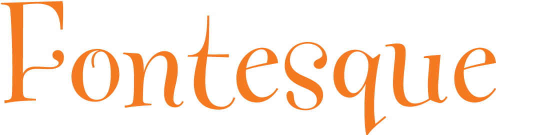
How is Fontesque pronounced?
Like humoresque and burlesque, picturesque, grotesque and arabesque. The design was wacky lettering, really, in tune with those grungy ’90s, but also made up like a deconstructed font, because by 1994 I had many years of serious typography under my belt, so I couldn’t very well leave Fontesque looking like it had escaped from a rough comp layout. Handsome, however, is a flat-out pun for a handwriting style. Or manicules, as per Jason Castle’s font of the same name—fortunately there’s no conflict between the two genres.

But there are two Browns, aren’t there?
There shouldn’t be, as my Brown was well established, over ten years, when Lineto published theirs. I asked them to change its name, but they refused, and that was a battle I wasn’t interested in fighting. Most of my types have registered trademarks now.

Even Scotch Modern? How were you able to register a trademark for an entire historical category of type?
Because I originated and defined the category. Scotch Modern is a new niche, as it were, between Scotch Roman and Didone.

Bodoni Egyptian too?
Sort of. That started life when digital fonts opened up the field for ultra-light weights, and as I had always comped serif styles with didone serifs, I just found myself drawing a slab-serif Bodoni, very thin. The rest of the weights followed on. I was aware of Ronald Arnholm’s Legacy Sans, derived from the Garalde, and various mega-families with sans and serif, so Bodoni Egyptian seemed like a promising idea—rather like arranging a piece of classical music for a different, more modern instrument.
But why Egyptian and not Slab?
The metre (double anapest), for one thing, and those three consecutive descenders for another! I imagine that certain London founders of the early 1800s paired Egyptian trendiness with the typographic novelty of the g-y-p sequence, such deep and varied shapes.

Alphaville, named after the Jean-Luc Godard film?
Yes, culture outside graphic design is a fruitful source of typeface names. I took Oneleigh from the name of a house in a Lord Dunsany novel, and Softmachine from Burroughs, not to mention a prolific British psychedelic band of the 60s and 70s. In each case the name had rich associations that seemed to fit the type design. Godard’s movie merged three eras—with a classic Hollywood private detective, contemporary modernist architecture, and a computerized future; similarly, my Alphaville is informed by three generations of technology—pen and ink, foundry type and digital techno.
Doesn’t the appropriation bother you?
It’s an accepted practice as long as one is judicious. That means avoiding trademarks, fictional characters, market confusion and political sensitivities. Ethics is a subtle business. If anything, spreading a made-up word is a form of meme-ing that provides publicity for the source.

I came across Oneleigh in a monograph of Sidney Sime illustrations, in 1980 or thereabouts. I recall that the entire book—cover title, body text and captions—was set in Korinna, very popular at the time. But that’s neither here nor there. The author saw fit to include a fair amount of the text that each painting or drawing illustrated, and that’s how I discovered Lord Dunsany, with his writing and Sime’s artwork leaving a lasting impression, something that came back to me 20 years later, when it seemed that I was seeking to realize, in a type design, a similar kind of historicist, fictional entity as the old house of Oneleigh.

This oxymoron—or is it a contranym?—just clicked, quite literally descriptive. Softmachine is a rounded font with a lot of kerning and contextual alternates, automated refinements that would have been impossible amounts of manual work prior to the new millennium, especially the contextual alternates.

But Neology is not actually a neologism.
No, although I do like the idea that with the pseudo-random effect, which OpenType made possible 20-odd years ago, a word doesn’t always look the same in the same font, the glyphs for each character being changed around to give the word a new look from one instance to the next, hence Neology. I also like the intellectual tone of “‑ology,” first noted in Charlie Parker’s “Anthropology” and “Ornithology.” Panoptica, Paradigm and Polypraxia are in the same vein.
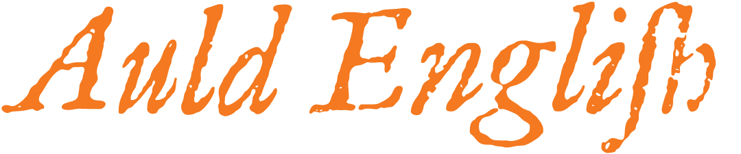
A lot of your type names begin with A or B, is that to be at the top of type menus?
Well yeah! Auld English hits several allusive buttons, such as the way the Auld English Spell version rewrites text into “old” English, and the fact that I found the typeface, which is a revival, in an old English book (despite it being a Garalde, likely from the Netherlands). So “Auld” it is, for both its strange familiarity—being such a rare word, yet one that everyone knows through Auld Lang Syne—and its position high up in font menus.
What’s in the offing, Nick?
I’m planning an interjection. I had the brilliant idea of “Mmmm,” but what do you know, André Toet beat me to the punch. However, I have another in the works, wait and see. ●