
 Fig. 1
Above: An enlargement of Cartier from The Magic Fiddler.
Below: A facsimile created with the Dair 67 typeface.
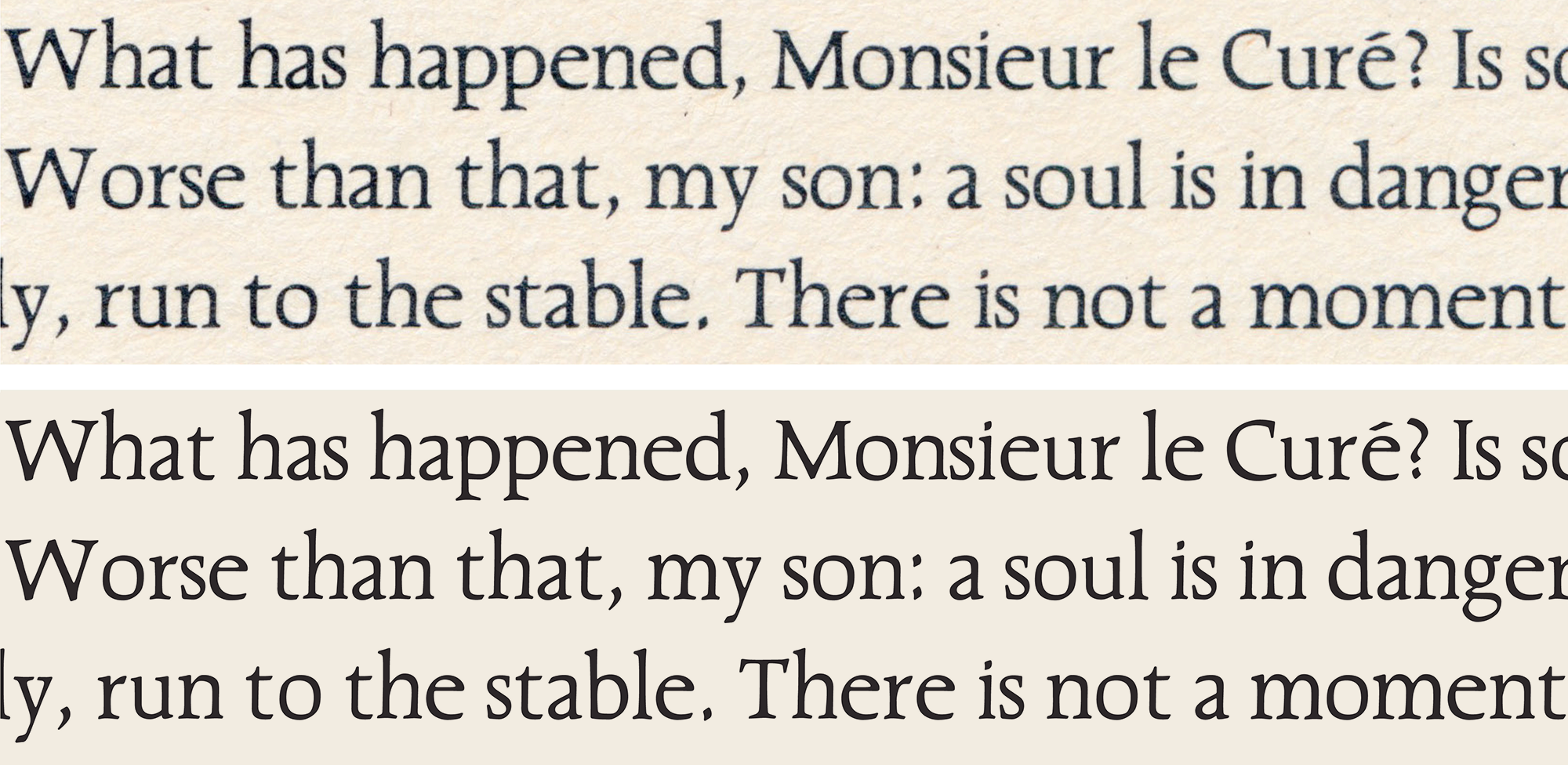 Fig. 1
THE TRUTH ABOUT DAIR
The history of Cartier, Canada’s first Roman typeface, and how I went about restoring it
Things created are both emergent and imagined beforehand. The typeface Cartier is an idea that Carl Dair conceived and set out to realize as fonts. But as with many an exceptional typeface, the author’s is rarely the final hand, and not always the definitive one (if such a thing is possible)—especially if they had the misfortune to die, as Dair did, while the fonts are still a work in progress.
He never had the opportunity to fulfill Cartier, succumbing to a heart attack on a plane from New York to Toronto in 1967; never able to refine his only type design, nor add small capitals, kerning, fractions, bold weights or display cuts.
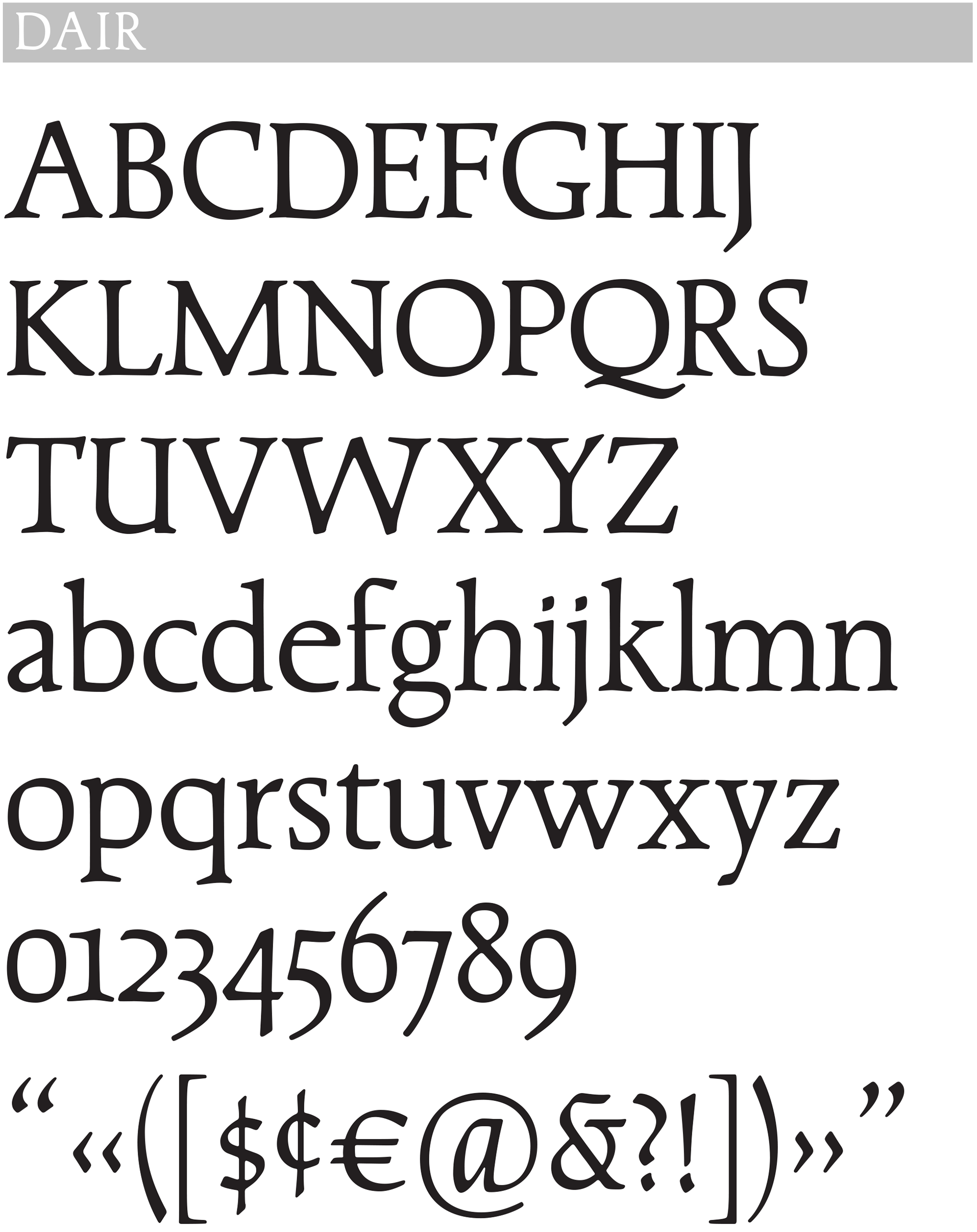
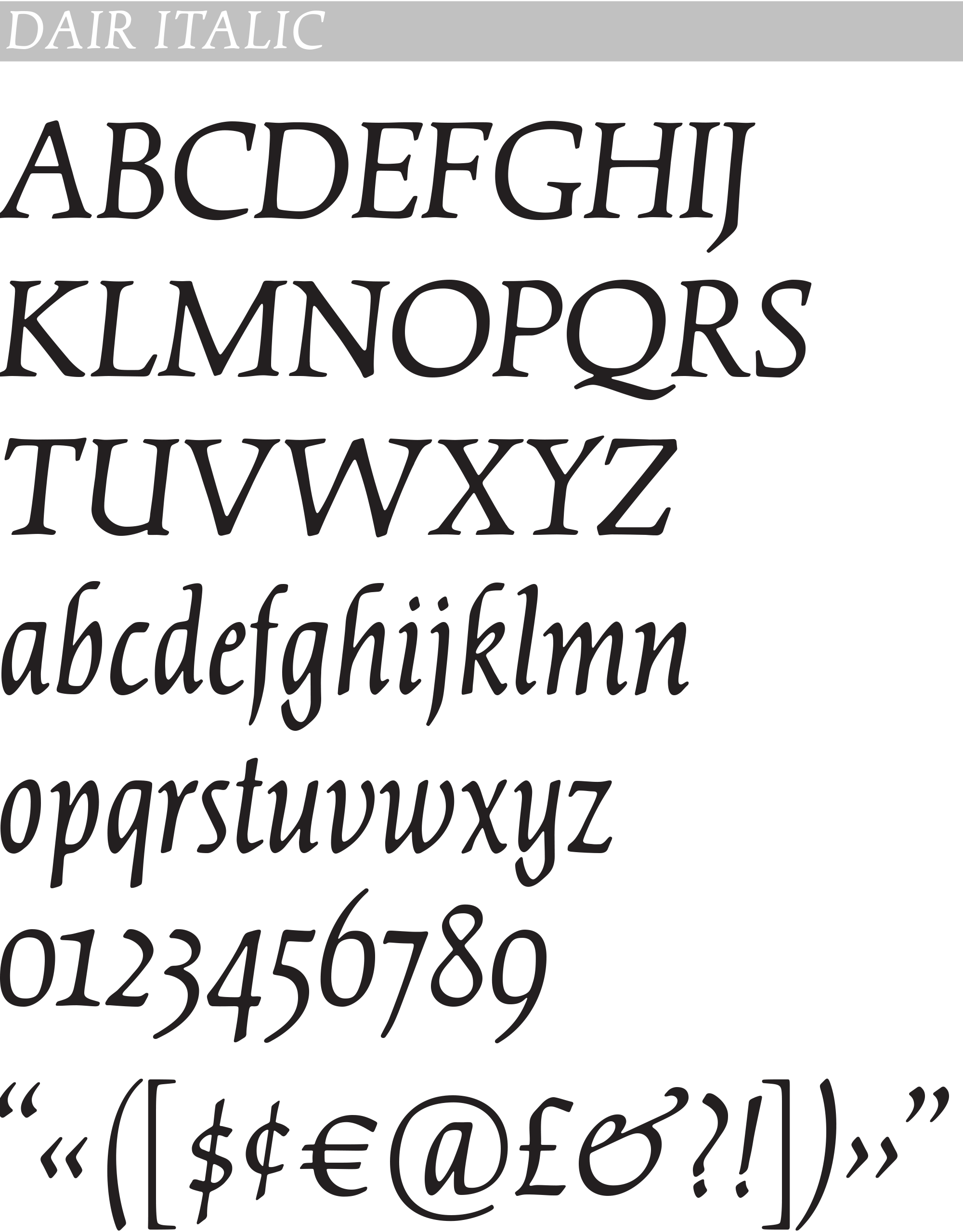
Some typeface revivals hew more closely to the original than others, and these have been termed, by Paul Shaw, restorations. This typeface, Dair, is my Canada 150 project (unofficial), celebrating Mr Dair’s 1967 Centennial design, Cartier, the first Canadian roman typeface. The goal was to create a digital font which could produce a facsimile of the original Cartier’s typography, and in so doing discover something of the type’s essence, existing, as it does, as both ideal and artefact.
Dair’s typeface was rather unusual and lacking a bold weight (just two fonts, roman and italic), so perhaps that is why it never achieved popularity, although it did become a minor fixture during the ’70s and ’80s in the niche of coffee-table books with Canadian content, such as those created by the Illustrated Book Division of esteemed publisher McClelland & Stewart. And notably, the official poster of the text of the Canadian Charter of Rights and Freedoms (1982) was set in Cartier.

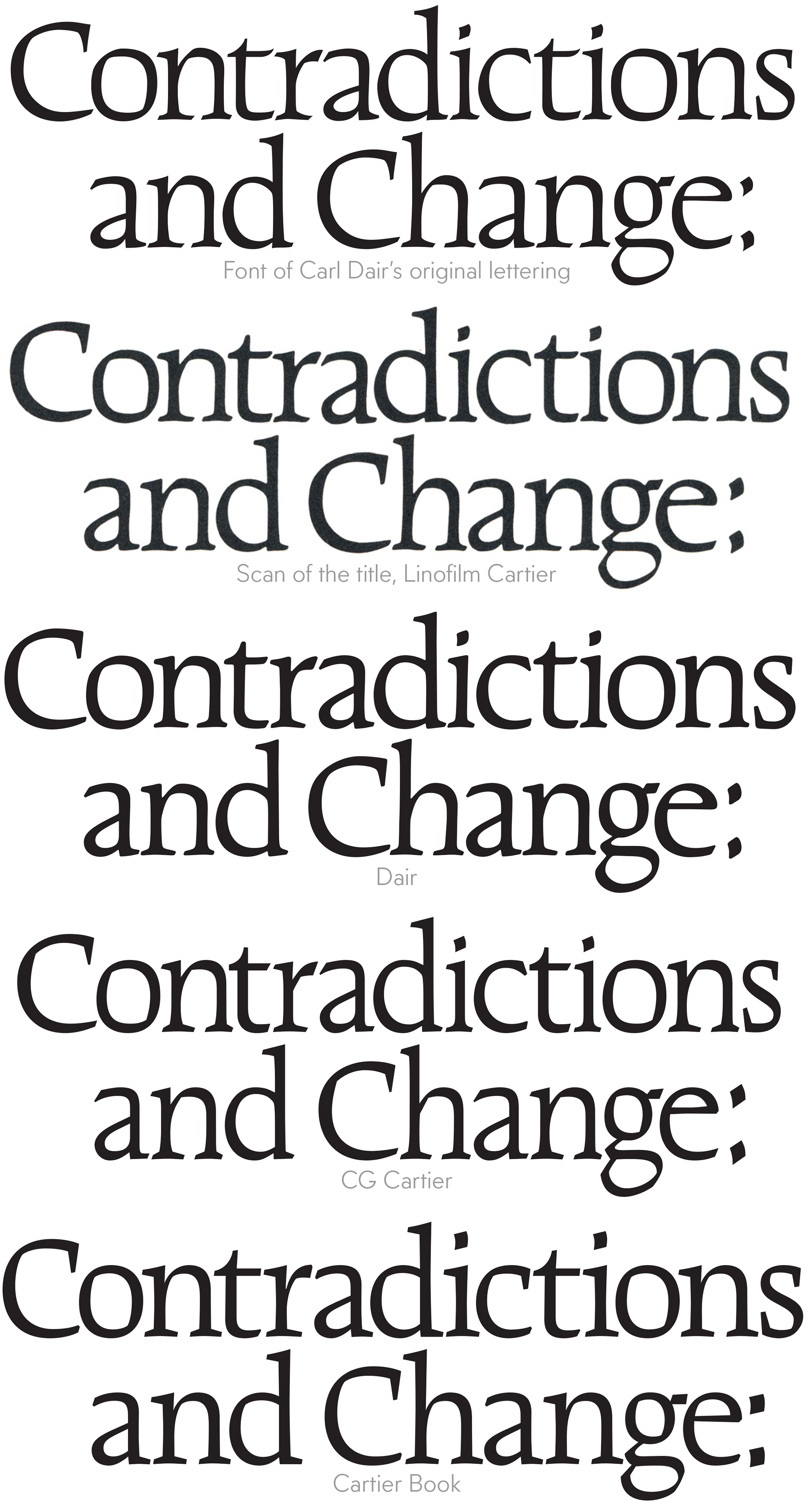
1967 Carl Dair’s original artwork (precise copy by Patrick Griffin).
1967 Cartier, published by Mono Lino, Toronto, in Linofilm format (photocomposition from film negative).
1977 Raleigh, a redesign by David Anderson and Robert Norton, published by Typsettra, Toronto, in various film-setting formats.
1982 CG Cartier, similar to the original, but sharper, licensed by Compugraphic from Monotype, for photosetting from CRT image and filmstrip.
2000 Cartier Book, redesigned by Rod McDonald for Monotype, digital.
2017 Dair, restored by Nick Shinn and published by Shinntype, digital.
When the graphic arts went digital around 1990, CG Cartier was available for a while, but withdrawn by Monotype and replaced with Rod McDonald’s 2000 redesign, Cartier Book, which departs considerably from the original. Rod has stated that Cartier was “…plagued with weight, stroke, and grid issues…” and sought to address these, but, while his redesign is a serviceable interpretation, the criticism is rather subjective—there is nothing wrong with the original, Carl Dair knew what he was doing.
My restoration, named after the man, is based on a printed sample of the typeface, in a book I discovered and fell in love with, The Magic Fiddler and Other Legends of French Canada by Claude Aubry, published in 1968 (fig. 1, above). Working in this manner, rather than from Dair’s drawings or the original film font, would, I reasoned, best capture his intention, and, given that his design harks back to the early days of typography, for which only the printed record remains (the fonts having long since been melted down and the metal re-used), be quite sympathetic—this is, after all, the way that the classic Renaissance types Jenson, Bembo and Garamond have always been revived.
Another, and more functional reason to work from the printed image: Dair’s ultra-retro design was informed by letterpress printing, a process he was deeply involved with, and in which there is notable press gain, with letter forms swelling in size during printing, the ink spreading down the edges of the type as it presses into paper, stretching it at the periphery of the letters. A slight softening of corners also occurs, as ink bleeds into paper fibre. Similarly, during photo-composition for offset printing (the method primarily used from the late 1960s until the advent of digital reproduction), letter forms lost their crispness incrementally as they were copied during pre-press production, being transferred photographically in at least three stages—from film font negative to positive galley, then from assembled art-boards to size-as negative film assembly, and finally when these were exposed onto printing plates.
I suspect Dair anticipated a transformation of his original drawings, with glyphs becoming softer and fatter, so he pre-empted this effect and drew his letters a little on the sharp and thin side. At any rate, the glyphs in the first Linofilm font are also a little heavier than his drawings. Now, with digital type, whether for print or screen, the subtle decay of font shapes does not occur; digital files are rendered directly to printing plate or computer screen.
So there is virtue, if one is closely reviving a letterpress or phototype era typeface for body text, in working from the printed image, not the original drawings or font. This was a lesson the type industry learned the hard way during the early days of the digital era (DTP or desktop publishing), when most versions of existing type designs were copied verbatim from artwork or fonts, resulting in body text that was somewhat weak and emaciated. The sturdy new book faces Scala (1990) and Quadraat (1992) were instrumental in elucidating and remedying the problem, as was Adobe Garamond (1989).
One more reason to mimic The Magic Fiddler—to differentiate my efforts from the Monotype/McDonald version, conceptually, aesthetically, commercially and legally. The space for type revival is broad, with room for many different interpretations of serifed styles; Cartier, Raleigh, CG Cartier, Cartier Book and now Dair demonstrate that Mr Dair’s design is indeed the real deal, with version proliferation just like all those Jensons, Caslons, Garamonds and Bodonis.
The context and form of Carl Dair’s design
With few exceptions, Canadian culture lagged behind that of Europe and the USA until after World War II. Then we caught up in a hurry, aided by institutions such as the NFB (1940), the Canada Council (1957) and the Art Directors Club, Toronto (1948), which held a contest every year, publishing an awards annual showcasing the winning entries. This practice was copied from the Art Directors Club of New York (founded 1920). Carl Dair was a member of the club and a frequent award winner early on. At the back of the annual was a section of edgily creative trade ads for suppliers—illustrators, photographers, agencies, paper companies, etc. Typesetter Cooper & Beatty was a client of Dair’s and advertised there.
Fig. 2
Type: the essence of advertising design [1951]
Spot-colour print ad on coated stock, 8¼”× 11”
Art Directors Club,Toronto, third annual
Written and designed by Carl Dair, demonstrating his penchant for typographic contrast.
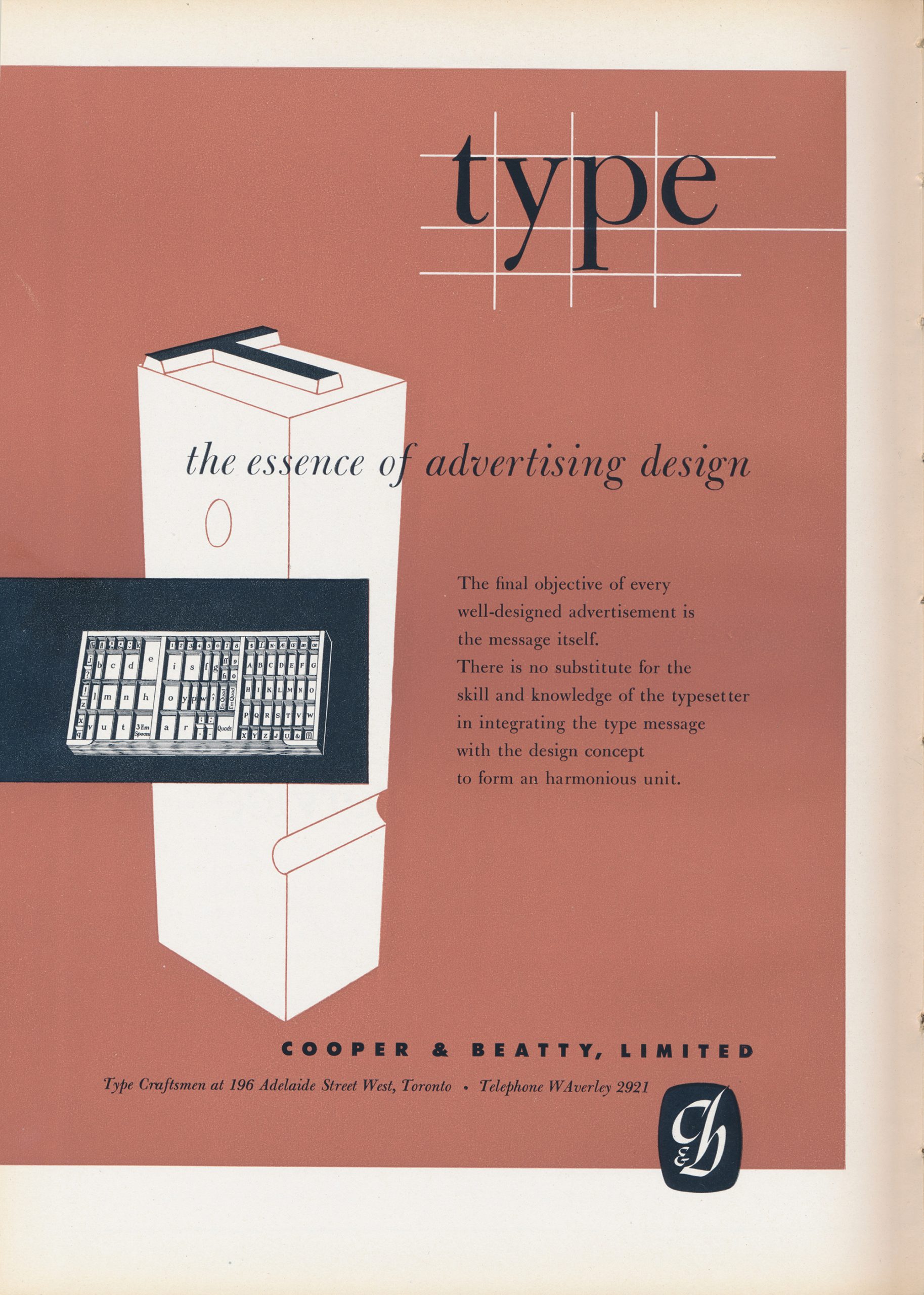 Fig. 2
This ad is from the 3rd annual, 1951, and shows the key role of contrast in Dair’s typography—maxed out between the headline in an all lower case italic serifed font (Bulmer) and the advertiser’s signature in extra bold all caps sans serif (Futura), letter spaced. Dair also wrote the ad, and designed and drew the cartouche logo.
Deeply engaged with typography both practically and intellectually, as well as being one half of the graphic design studio Eveleigh and Dair, he had written and lectured for several years before producing the book Design with Type, published by Pellegrini & Cudahy, New York, 1952 (later substantially revised, re-issued in 1967 and still in print). The book is largely structured around the concept of contrast, in its many dimensions.
Fig. 3
Carl Dair now offers his clients… [1955]
Letterpress on cream laid stock, 8”× 11”
Art Directors Club of Toronto annual
The typeface is Post Antiqua.
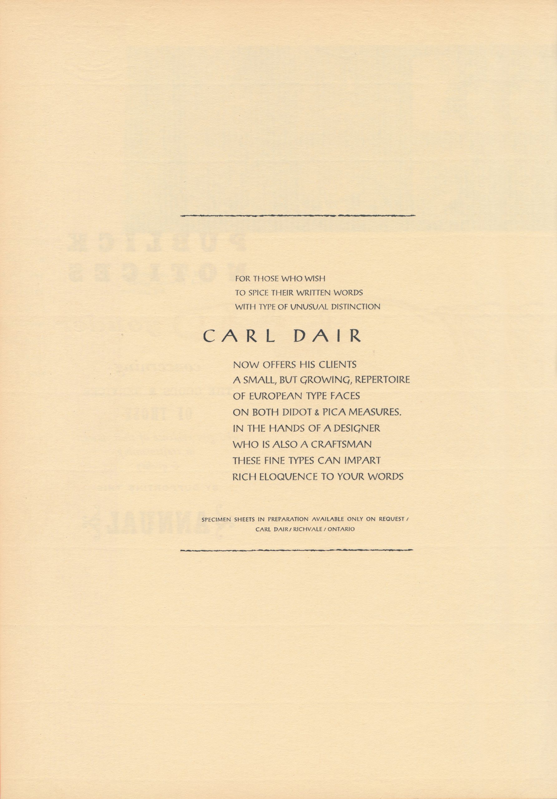 Fig. 3
In the 1955 Art Directors Club annual, Dair advertised his services as a typesetter (fig. 3), before heading off to Holland in 1956, with a government grant, to study the ancient skill of punchcutting at the Enschedé foundry—no doubt he considered this essential preparation for the ur-Canadian typeface he was planning, not necessarily because he intended to punch cut it, but because he needed to physically absorb the fundamental DNA of roman type at its point of genesis, through the action of hand and eye upon metal.
Fig. 4
Karsh & Fisher See Canada, title spread [1960]
Process colour on matte stock, page 7¼”× 9¾”
Dair cleverly incorporates the symmetry of the heraldic crest into his flush left layout. He runs the gamut of Pilgrim (a typeface by Eric Gill)—display, italic, all caps, small caps—avoiding lower case roman and italic capitals, to which he seems to have had an aversion.
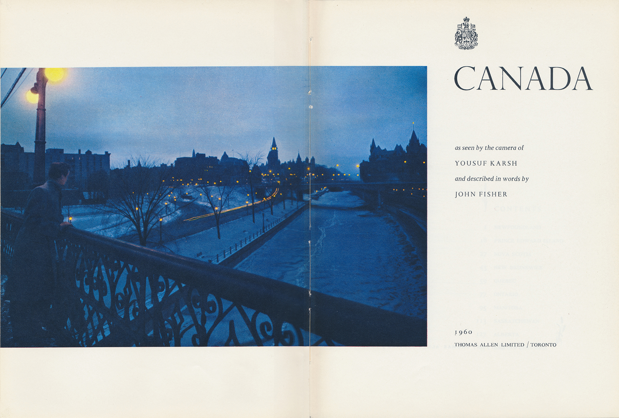 Fig. 4
Given the modernism of Dair’s graphic design, demonstrated, for example, in his page layouts for Karsh & Fisher See Canada (1960, fig. 4), full of asymmetry and white space, why then was the typeface he designed, conceived in 1955 and produced with the assistance of a grant for the Centennial, the modernity, nay, the futurity of which was exemplified by Expo 67 with its geodesic dome, monorail, Habitat, and Univers typography, why was it an oldstyle serifed design, echoing the early days of type, and pointedly referencing the 16th century in its name? (Explorer Jacques Cartier mapped the Gulf of St. Lawrence in 1534.)
The answer is complexity. For as much as modernity in the 1960s was high-tech and minimal, it was also eclectic and primitive, embracing the long ago and far away as well as the here and now. In classical music, there was experimentation with electronics, and also the birth of a period-instrument movement. In mid-century modern architecture, the austere quality of built form, in which ornament was crime, was humanized by the organic patterns and textures of wood grain, marble striation and raw concrete (beton brut). Similarly, in the coffee table books of the era—in which Cartier was to find its metier—the cool tonality of spare, asymmetric layouts was contrasted with body text-ure set in Garamond and Bembo, classic 16th century types which had been revived in the historicist era of the early 20th century and have flourished ever since.
In his sumptuous 1967 celebration of Canada, To Everything There is a Season, the king of coffee table books, photographer and designer Roloff Beny paired headlines in the Expo 67 headline face, Optima, with text in Poliphilus and Blado.
Fig. 5
Landmarks of Canadian Art [1978]
By Peter Mellen, published by McClelland & Stewart
Black on off-white satin stock, page 12½”× 10½”
The heading is hand set in the tight-but-not-touching style of the 1970s
Below: Duplications in different Cartiers.
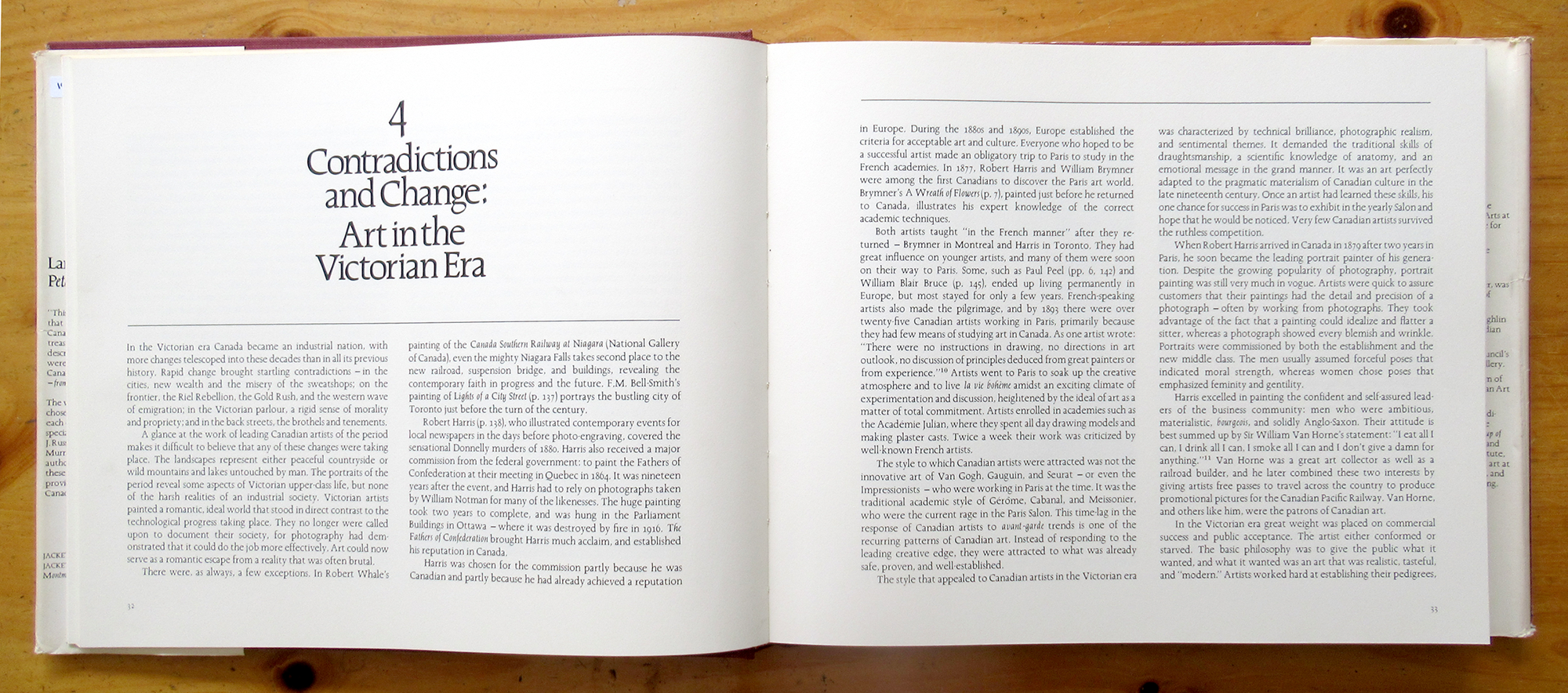 Fig. 5
During the 1960s, typography trended towards very tight fit, driven by the capabilities of dry transfer (e.g. Letraset) and typositor setting. In serifed types, this favoured the oldstyle over the moderns (didone), as the angled stress of the former’s curves does not concentrate weight spottily in adjacent round letters, and the serifs too are shaped to avoid one another in close proximity; also the quality of spacing depends more on the disposition of white space than the regularity of vertical stems. Cartier performs well in the “tight-but-not-touching” look of its era (fig. 5), even in all cap settings, where letterspacing is generally preferred for serifed faces.
Fig. 6
Max Braithwaite’s Ontario, title spread, [1974]
Published by J. J. Douglas
Black on cream stock, page: 6”× 9”
Typical “Canadiana” use of the original Cartier, closely set and wrestling, of course, with the spacing and bounce of the italic.
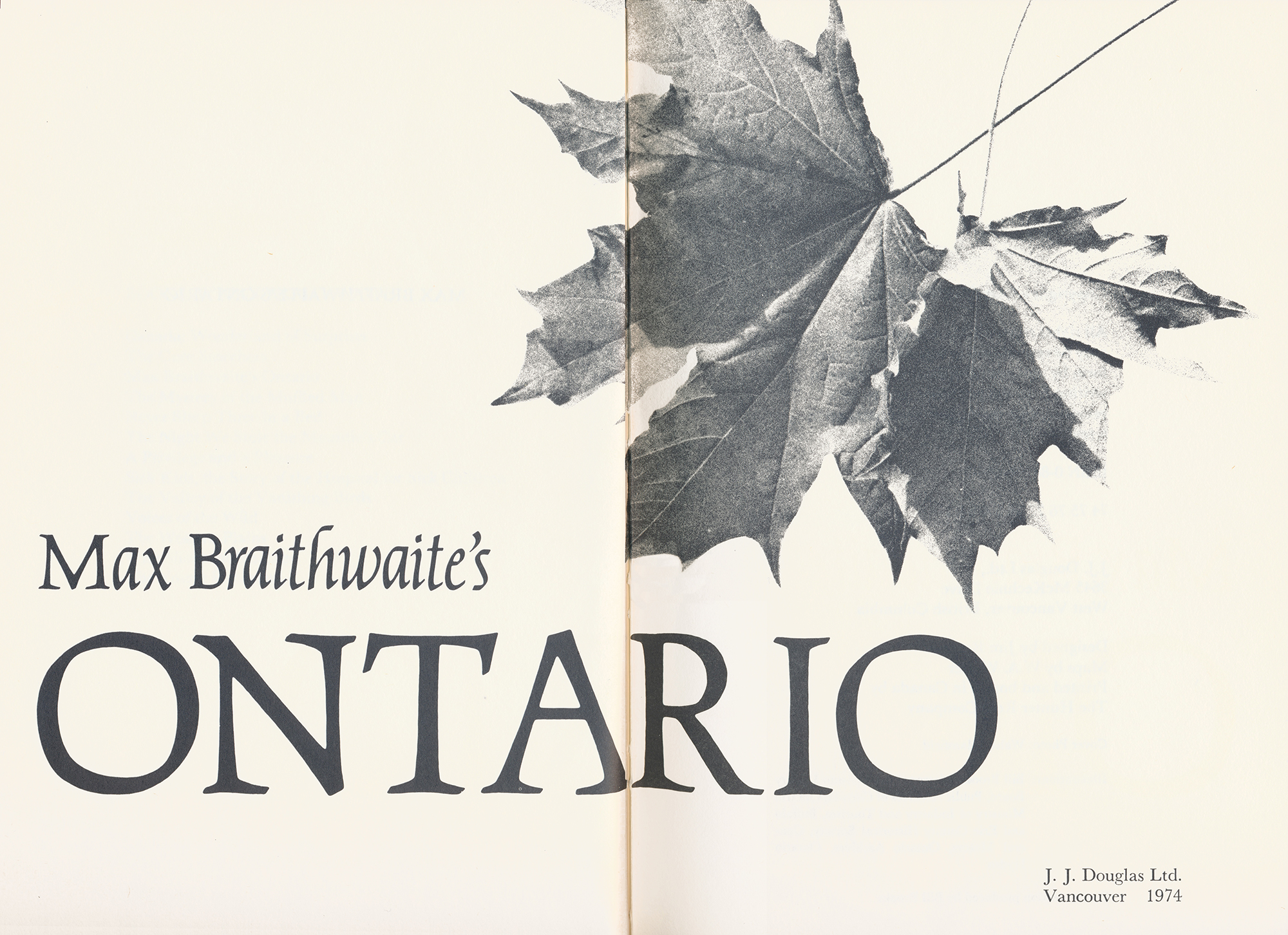
Fig. 7
Left: Palatino lower case c, Right: Cartier capital C
The influence of the broad-nibbed pen on the construction of the letters is apparent, though differently phrased.
 Fig. 7
Clearly, Hermann Zapf’s ubiquitous Palatino (1949) had a significant influence on Cartier. Frederic Goudy’s types had demonstrated the possibilites of new original styles in the manner of the Renaissance, notably Kennerley (1911), with a ductus informed by the angled, broad nib pen. His letters smoothed out the transition of curved strokes betweeen horizontal and vertical, but Zapf took it a step further and animated Palatino with the distinct suggestion of the nib’s presence at many of its bends, and this quality is apparent in Cartier (fig. 7). It occurs in another contemporary new German oldstyle, Georg Trump’s Trump Medieval (1954).
Fig. 8
Québec [1960]
Dust jacket. 8½”× 11”
René Demers, designer
Hounslow Press
The font is Baker Signet, a sans serif contemporary of Cartier that shares its large x-height, taller-than-caps ascenders, and amenity to ultra-tight setting.
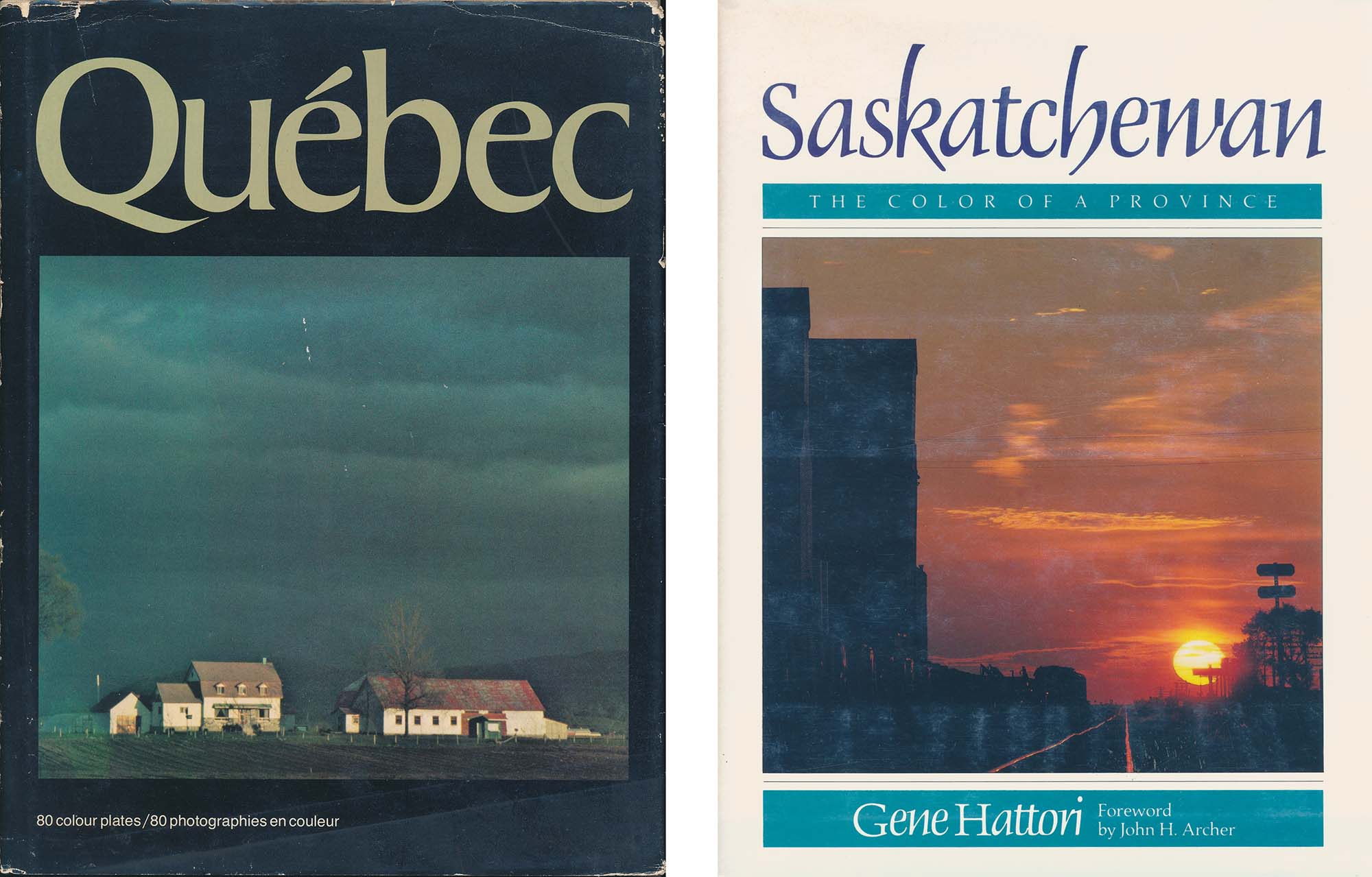 Fig. 8
Saskatchewan [1978]
Dust jacket. 8½”× 11”
John Luckhurst, designer
Published by Western Producer Prarie Books
The font is Delphine (1953) by Georg Trump. Cartier’s italic was cut from the same cloth, with short roman capitals and calligraphic lower case.
Further demonstrating Cartier’s grounding in calligraphy are the tapered top right vertical serifs of the capitals, exhibiting the method by which calligraphers rotate the nib and raise the right edge while dragging its left corner down to finish at a point, leaving a slight indent at the right along the way. Such calligraphic infrastructure is even more evident in Les Usherwood’s first great success, Caxton (1981).
However, what distinguishes Cartier most from its precursors and descendants is not its calligraphic quality but its outrageous proportions, and it is here that Carl Dair showed his commitment to contrast without reservation. Few typefaces have ascenders which loom so loftily above capitals, few if any have italics so much narrower than the roman. At the character level, “e” has a tiny eye contrasting a gaping aperture in both roman and italic; similarly, the roman “a” and “A” have small closed counters. “M” and “W” are magnificent, wide letters, while “S” and “s” appear to have escaped from a condensed font. In the italic, true to the style of Aldus (c.1500), the capitals are roman! Trump’s Delphine of 1952 has a similar feature, and towering ascenders. Arthur Baker’s Signet (1964) is also comparable in this respect, calligraphically informed and amenable to tight fitting (fig. 8).
In the manufacture of the Cartier fonts, Dair’s designs were rendered into film fonts at Monotype Corporation’s US facility quite roughly—omitting the usual step of re-working into precise engineering drawings by Monotype draftspersons. This was a saving in time and expense for Dair and Mono Lino (as was the re-use of roman capitals in the italic), and also ensured that the hand-rendered concept he had been crafting for over a decade would not be derailed by others who weren’t familiar with his line of thought. His wariness was likely buttressed by the words of Fred Goudy in Goudy’s Type Designs (Myriade Press, 1946) concerning the manufacture of Garamont:
“Drawings like mine which were made free-hand, were not the sort usually worked from at the Monotype Company, so there was a constant fight to see that the workmen did not ‘correct’ what seemed to them to be bad drawing on my part. If I intentionally gave a letter an inclination of one degree, they straightened it up. My serifs, which had a definite shape, were changed to meet their own ideas, since they ‘had always made them that way.’ ”
Subsequent revision, in the Compugraphic version, did indeed straighten things up, e.g. the vertical stem of “a”.
Fig. 9
Left: Scan from The Magic Fiddler, high-contrast. Centre: Imported into FontLab, background layer. Right: Bezier paths manually traced.
 Fig. 9
The restoration
I scanned a page of The Magic Fiddler. Despite the 600 d.p.i. resolution of my scanner, the magnification was extreme and the images of 12 pt. type less than perfect. I imported the letters from Photoshop into the Background layer of FontLab, bitmapping adding further imprecision; all to the good—the necessity of interpretation would assure a distinct personality for the reworking. In the Outline layer, I traced (fig. 9), setting down bezier points and dragging out handles to bend curves, vaguely at first, then refining my drawing in successive feedback loops, referring to the source by loupe to get a close look at detail, and adjusting the letters to one another, comparing glyphs in the Metrics panel.
I did use Dair’s drawings in one respect: for the character widths he had indicated, because they are the key to the way his fonts worked. Designing to the Linofilm system, he shaped letters within a limited number of widths, with the maximum being 18 units (W) and the smallest 2 units (comma, period). These “unitized” character widths included the sidebearing on either side of the glyphs.
Fig. 10
Above: A scan of 12 pt. Cartier from The Magic Fiddler. Note how the narrow right sidebearing of the “n” closes up its proximity with “e” (compare with “l_e” sequence), focusing attention on the white space of the letters’ open counters as the key element in their relationship. Similarly, a composite pseudo-counter is formed by “e_a”. Below: The same setting in different fonts.
 Fig. 10
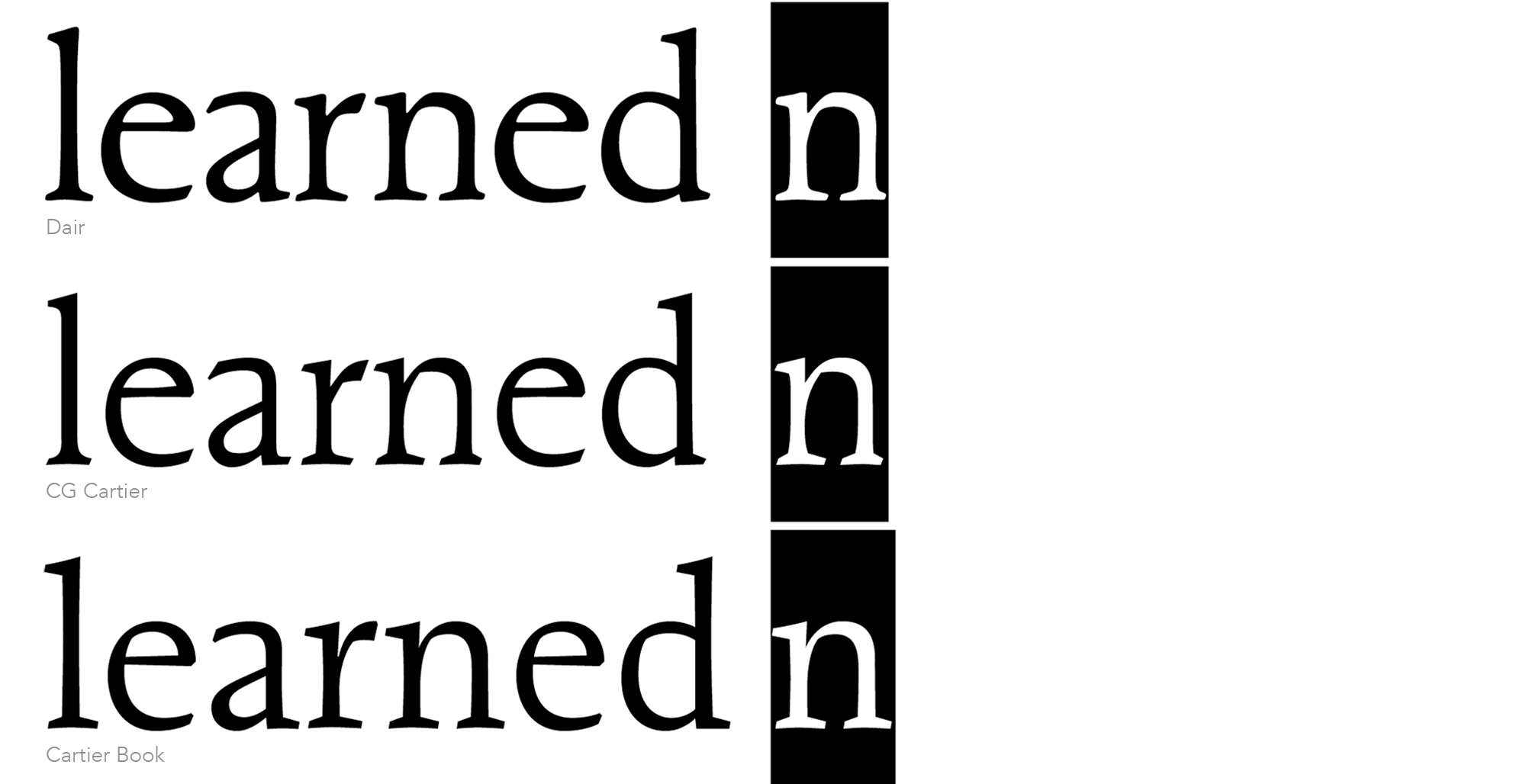
Notably, neither the serifs nor the sidebearings of vertical stems in lower case letters are uniform, most obviously being quite narrow on the right of h, m and n (fig. 10). Now, one might think that this would be a detriment to the evenness of text colour, but in fact it posits two kinds of readability: one like Cartier, in which the overall balance of spatial areas between and within characters is emphasized, privileging the space within over the space between, and another, like Cartier Book, in which the regularity of serif shapes and stem-to-stem distance is paramount.
The constraints of unitization provided a framework for a typographic rhythm that choogled along in a relaxed manner (more Harley than Hayabusa)—a little gappy here, a little squishy there—and this loosely woven texture was not smoothed by kerning, which was absent in the Linofilm composition of 1967.
The x-height vibrates, for which there is plenty of precedent in the classic book faces. The idea that glyphs should conform in x-height is rather slavishly adhered to in current type design, a consequence of the PostScript Type 1 format’s Alignment Zones, which were configured to temper artefacts in the low resolution of early digital media, artefacts now largely obsolete.
As comprehensive kerning is de rigueur in today’s typefaces (and of course Dair would have wanted it) I’ve added that, tightening things up ever so slightly, while making the x-height and cap height a tad more consistent, to maintain the degree of irregularity across different aspects of the design.
And I’ve departed from the simple unitization scheme in a few characters, most notably the lower case “s”. Certainly, Dair wanted a narrow “s” (Baskerville has one), and 6 units would have been too wide, but 5 is cutting it too close, so I gave it some room to breathe—5½ units, so to speak.
Fig. 11
Above: Bezier construction of Adobe Garamond serif.
Below: Bezier construction of Dair serif.
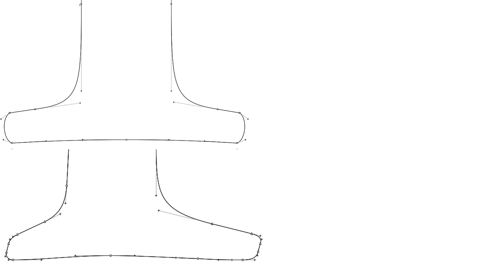 Fig. 11
It’s all very well to work from a printed specimen, but one has to come to terms with rendering the vagaries and artefacts of the printing process, including the blur of press gain. A systematic and deliberative treatment of detail is required, not just because the type may be used at display size and people admire precision, but also because taking account of the vocabulary of detail is how typographers familiarize themselves with typefaces, identifying and categorizing serif style—if not literally, at least in a purely visual manner, as the material of gestalt. In my Dair, the amount of sharpness/blur at corners is definitive, most critically in rendering serifs. The shaping of these was informed by Hermann Zapf’s Melior (1952), and more specifically by Robert Slimbach’s technique in Adobe Garamond’s PostScript outlines, with his omission of extrema x-axis Bezier points (fig. 11).
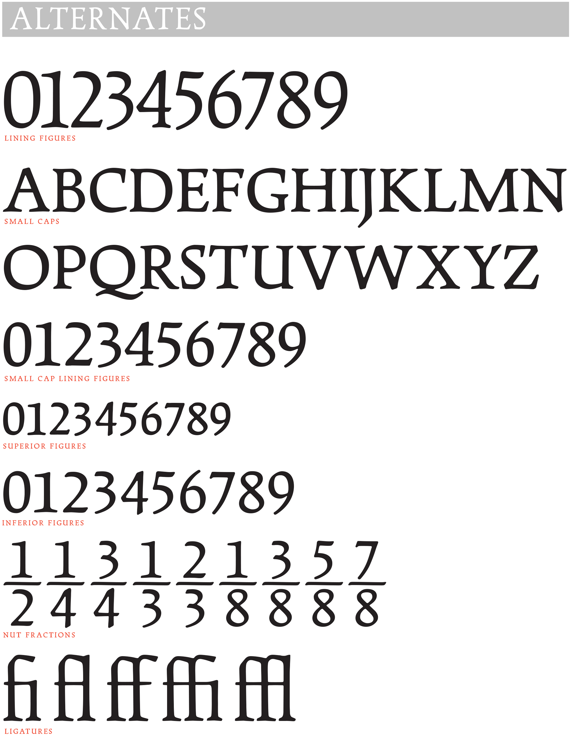
For a book face, Cartier was seriously lacking in the niceties of expert typography: small caps, fractions, alternate figures, and so forth. These days, such types are expected to contain extended language support and many OpenType features, so I’ve added to and adapted Dair’s work to provide these.
All in all, the Dair typeface is smoother and more substantial than the original Cartier. I’ve made concessions to the present day, adding kerning, providing a Q with a discreet tail, and giving the italic capitals a six degree slant. But it’s still quite possible to use the Dair fonts for facsimile setting of the original Cartier, because I’ve also provided alternate fonts, named “Dair 67,” which have no kerning and upright capitals in the italic. And for good measure “Dair TBNT,” specially kerned for tight but not touching—the style of display setting popular in the 1970s (see fig. 5).
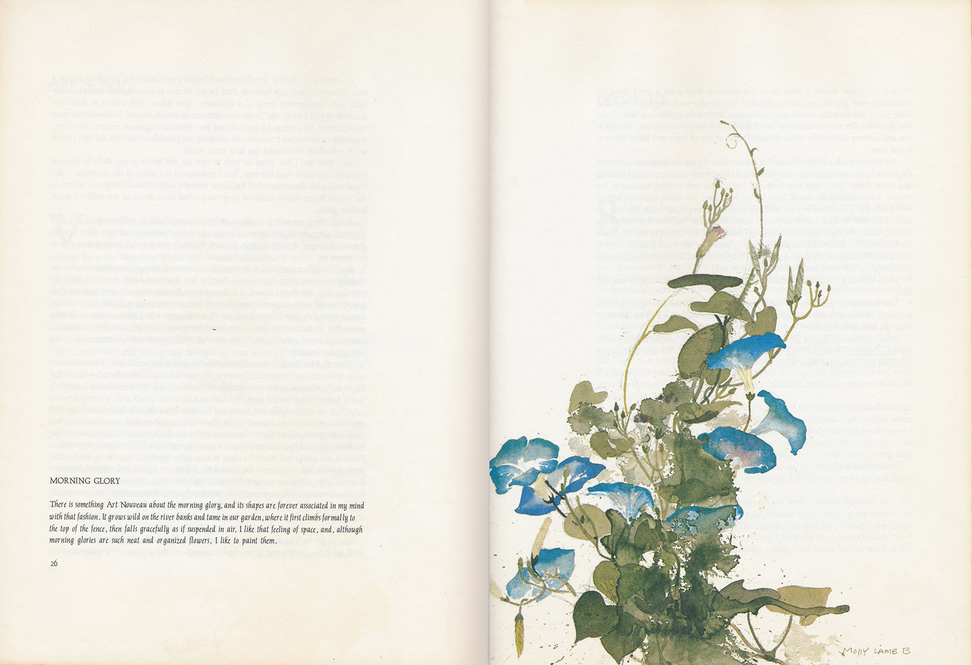
Coffee table books: text samples
Heritage: A Romantic Look at Early Canadian Furniture [1971]
McClelland & Stewart, coated stock, page: 9½”× 12½”
Linofilm Cartier, 12/13 pt.
Wild Flowers of Canada [1978]
Molly Lamb Bobak
Pagurian Press
Off-white, uncoated stock, page: 9”× 12”
Linofilm Cartier, 12/15 pt
The unruly italic was border-line acceptable in an art book such as this, complementing the gestural quality of the paintings.
Lawren Harris [1969]
By Lawren Harris
MacMillan of Canada, white matte stock
Linofilm Cartier, 16/20 pt.
Large type, generously leaded, for a large book
The Gulf of St. Lawrence [1984]
McClelland & Stewart, coated stock
CG Cartier, 11/13 pt.
Photoset fail. The type is too tight and the word spaces too large, and the skewed italic (which addresses the slight 6° angle of Cartier Italic and its lack of italic capitals) is unfortunate. The glossy stock is good for photos, but does no favours to CG Cartier, which comes across thin and spiky.
The Group of Seven and Tom Thomson [2003]
Linda Gustafson, designer
Firefly Books, satin stock
Cartier Book, 11/20 pt.
A new look for Cartier typography. The open tenor of Cartier Book handles the wide measure and deep leading with ease. There is breadth in the letter-spaced small caps and Rod McDonald’s decisive widening of the italic.
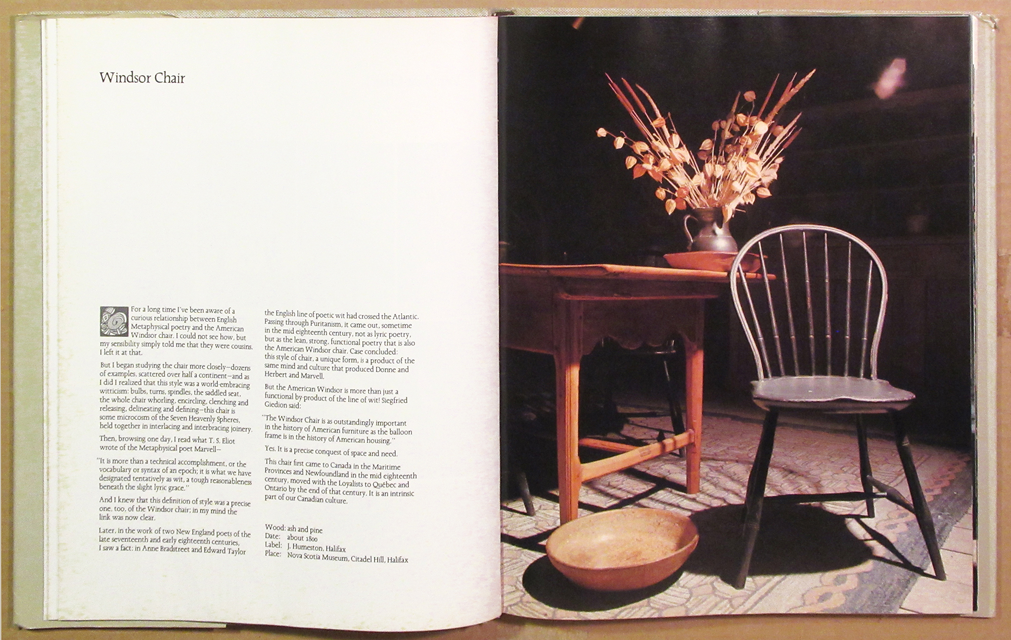
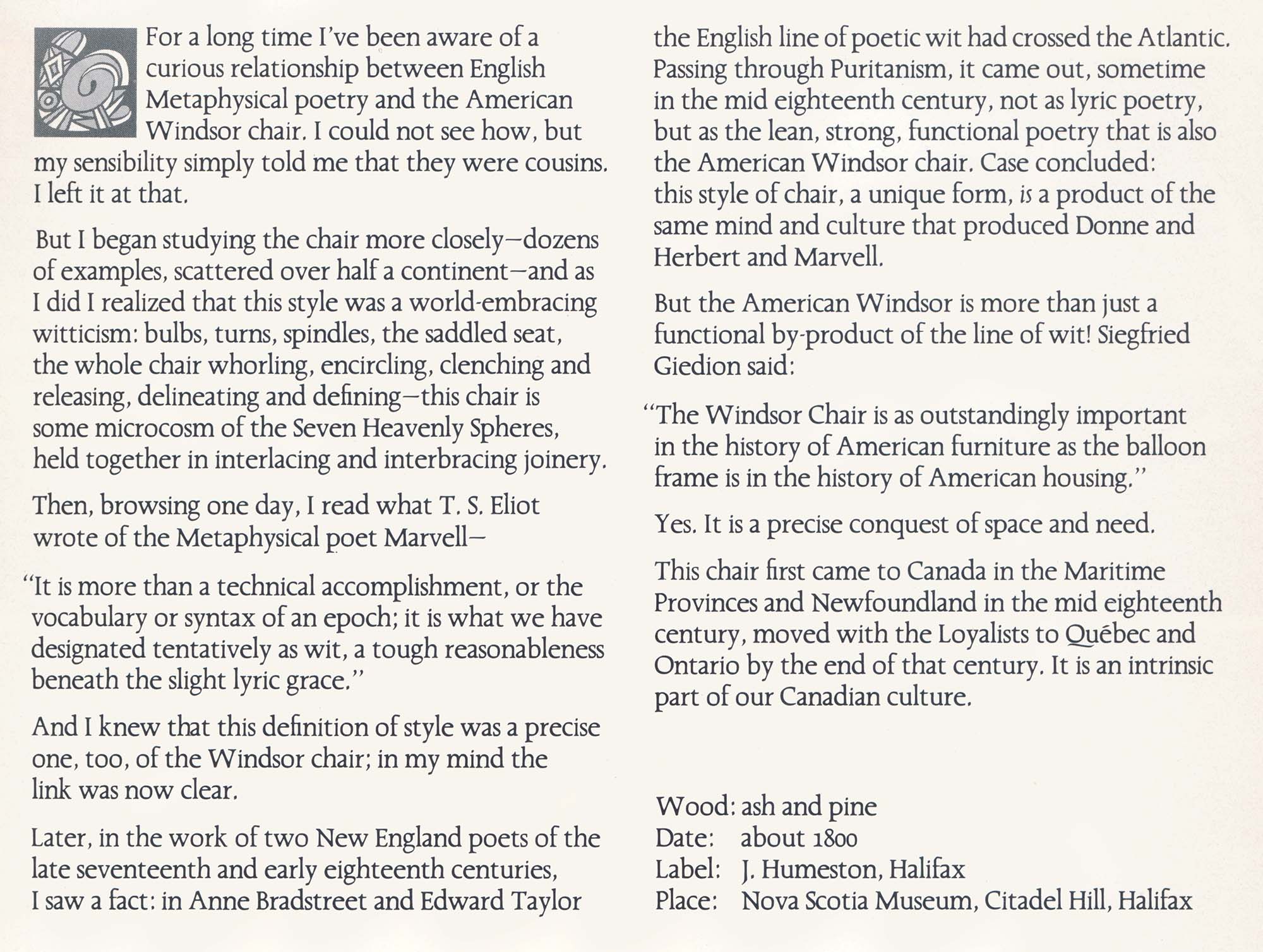
Heritage: A Romantic Look at Early Canadian Furniture [1971]
McClelland & Stewart, coated stock, page: 9½”× 12½”
Linofilm Cartier, 12/13 pt.
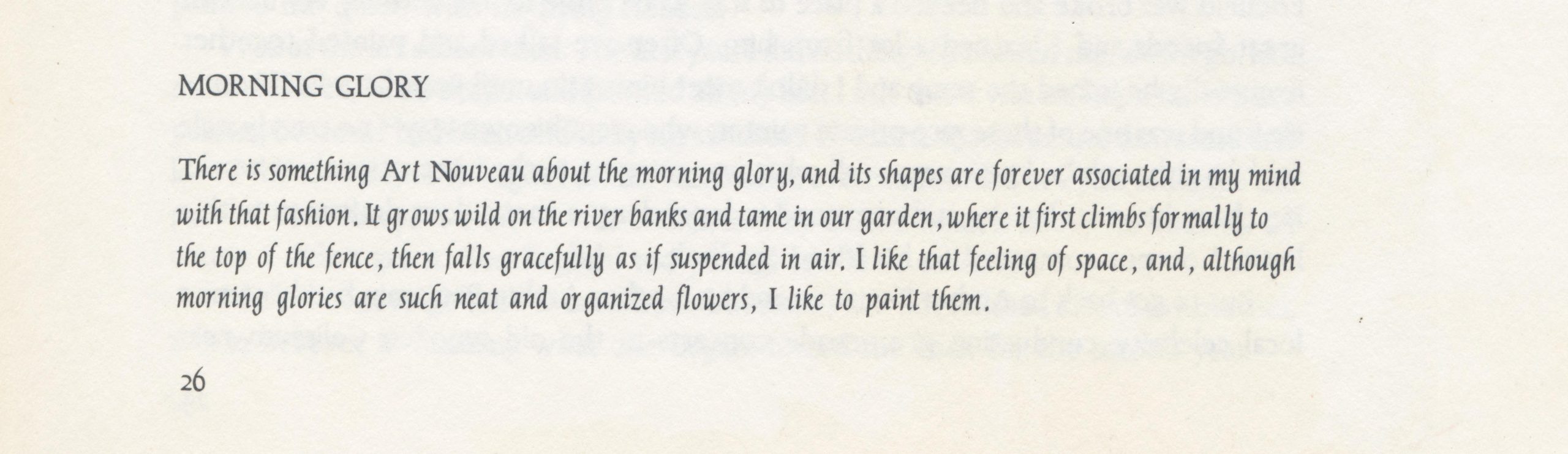
Wild Flowers of Canada [1978]
Molly Lamb Bobak
Pagurian Press
Off-white, uncoated stock, page: 9”× 12”
Linofilm Cartier, 12/15 pt
The unruly italic was border-line acceptable in an art book such as this, complementing the gestural quality of the paintings.
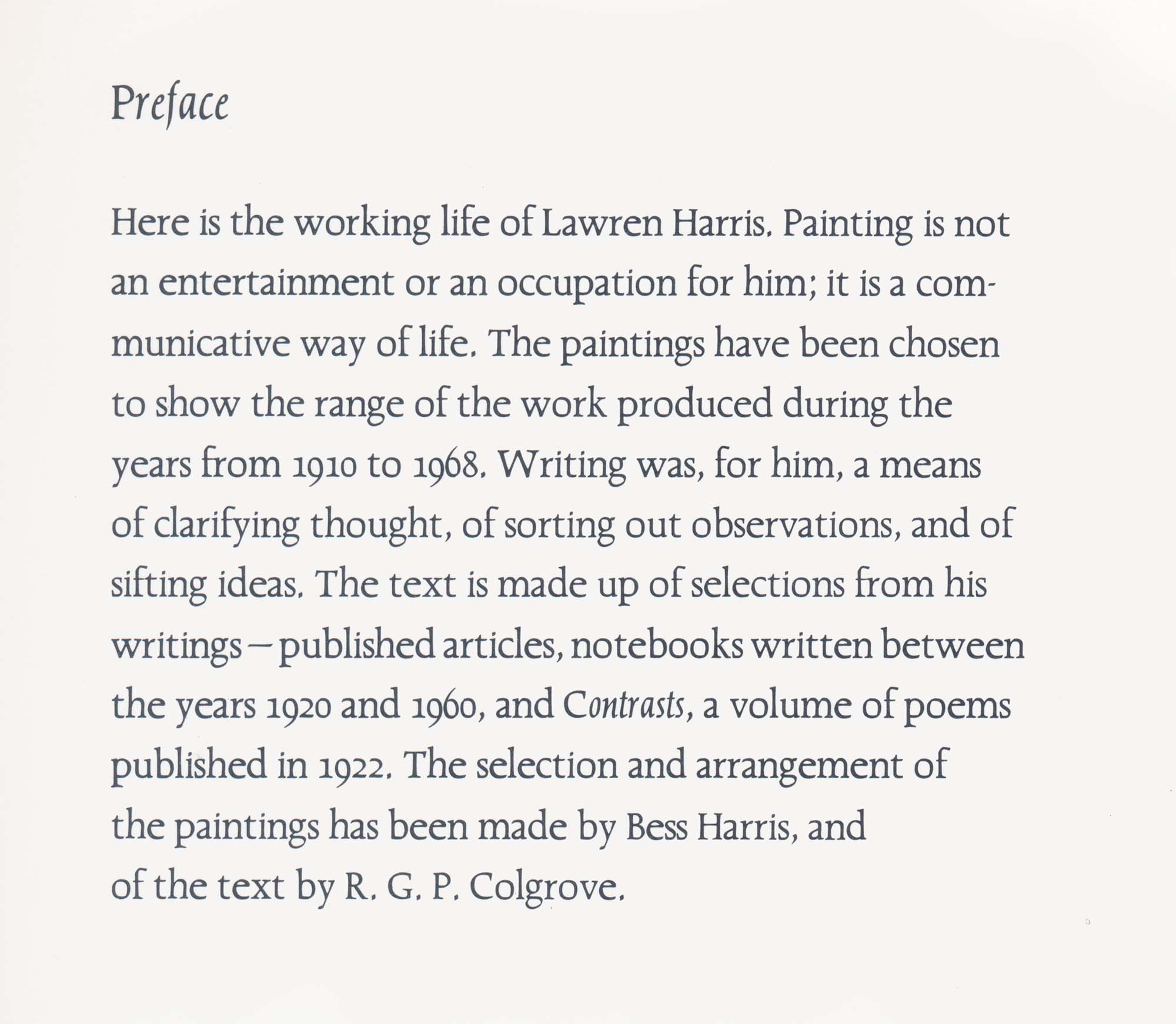
Lawren Harris [1969]
By Lawren Harris
MacMillan of Canada, white matte stock
Linofilm Cartier, 16/20 pt.
Large type, generously leaded, for a large book

The Gulf of St. Lawrence [1984]
McClelland & Stewart, coated stock
CG Cartier, 11/13 pt.
Photoset fail. The type is too tight and the word spaces too large, and the skewed italic (which addresses the slight 6° angle of Cartier Italic and its lack of italic capitals) is unfortunate. The glossy stock is good for photos, but does no favours to CG Cartier, which comes across thin and spiky.
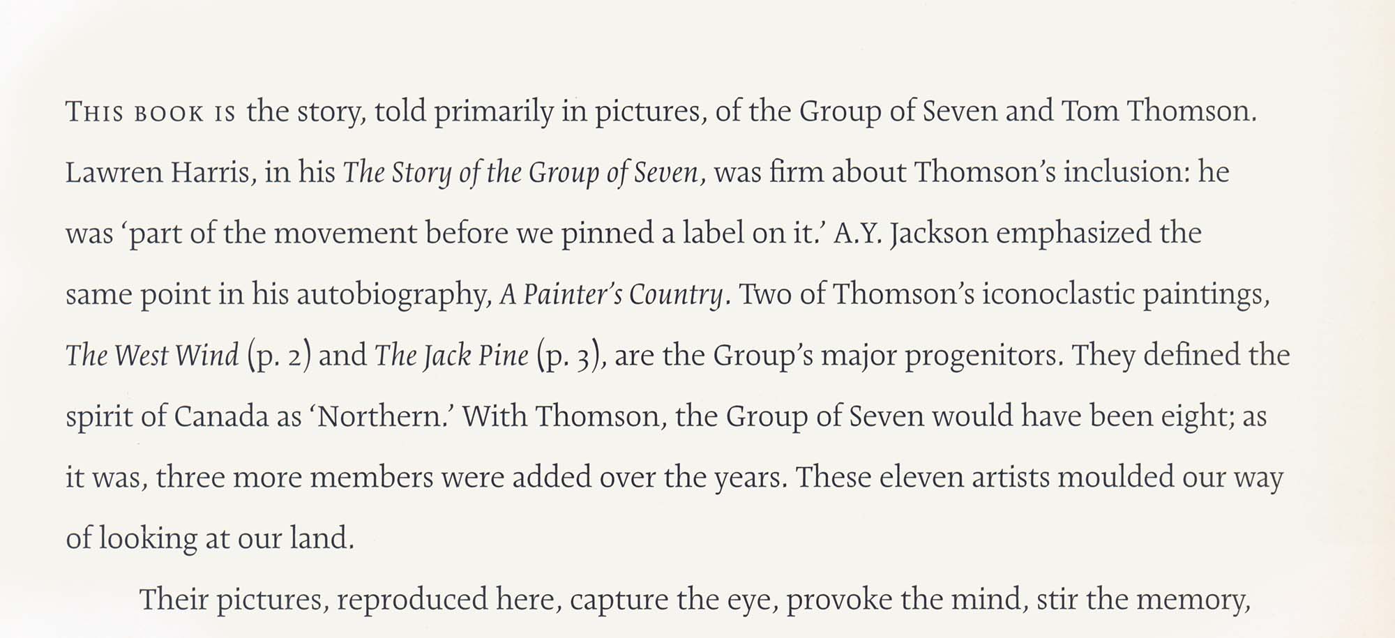
The Group of Seven and Tom Thomson [2003]
Linda Gustafson, designer
Firefly Books, satin stock
Cartier Book, 11/20 pt.
A new look for Cartier typography. The open tenor of Cartier Book handles the wide measure and deep leading with ease. There is breadth in the letter-spaced small caps and Rod McDonald’s decisive widening of the italic.
This essay in PDF format, 8½”x 11”.
The Dair fonts may be licensed from Shinntype.
●