
TOP TEN 2025
It’s been a busy year!
Creating for social media is a bit of a grind, and a lot of work for something so ephemeral—but I love doing it, especially as I’m collaborating with my daughter Zoë Shinn.

1. BEST SELLING TYPEFACE
Once again it’s the Aptly (2020) family.
Handsome Regular (2000) was the top individual font.

2. TEXT HEAVY GALLERY SHOW
Hanging banners was curator Robert Tombs’ suggestion, and I designed a dozen for my Text Heavy show in Ottawa in November—all describing the typefaces in which they’re set. They became an installation, utilizing the gallery space and how people could walk around and between them. And get real close to very big typography.
3. MOST WATCHED VIDEO
Text Heavy: The Art of Type Design by Nick Shinn, on Instagram, Tik-Tok and LinkedIn.
This followed our basic socials format, me talking in the Shinnstitute library, interspersed with cutaway shots—but something about it captured more than usual interest.
4. RADICAL NEW-OLD TYPEFACE
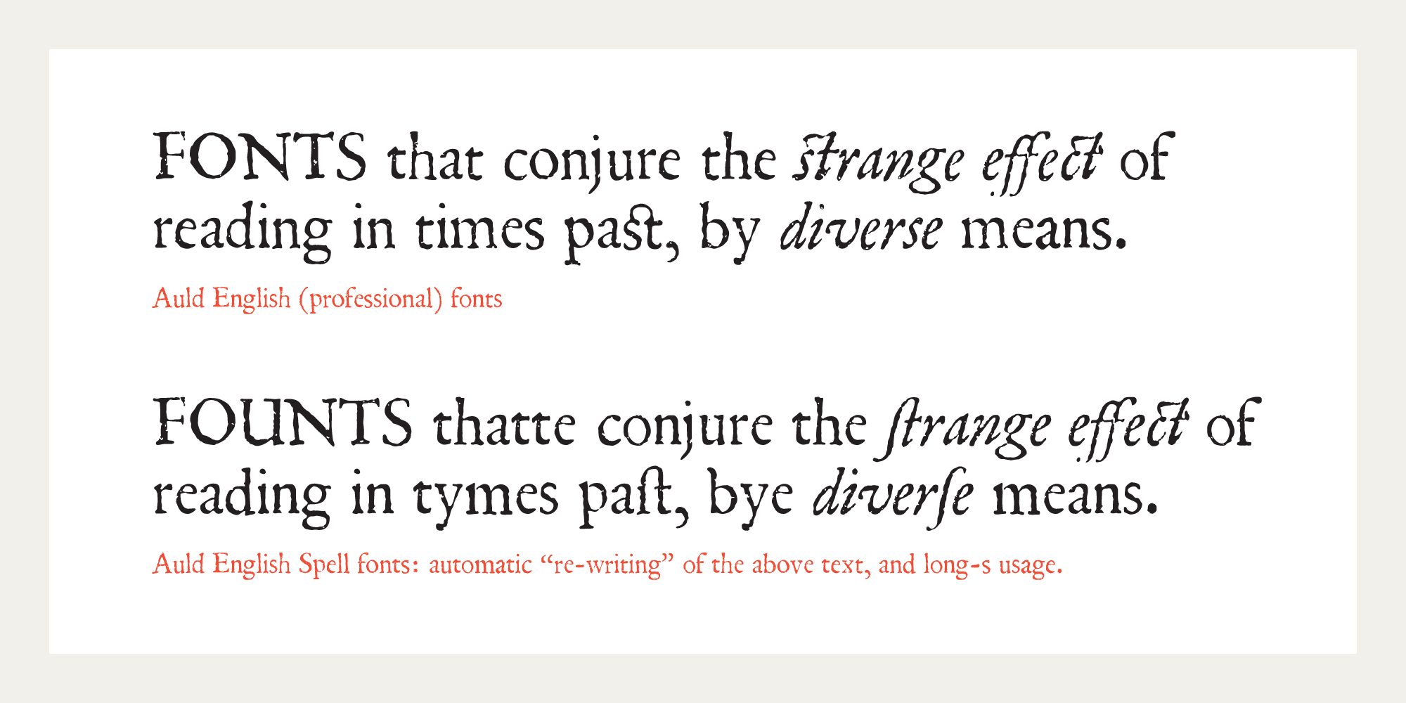
I didn’t discover anything I didn’t know before, but I had a revelation when working on Auld English (a 1650 Garalde facsimile that simulates the experience of reading in the Early Modern English era). This was the realization that three changes in the English Language—involving spelling, a grapheme (long-s), and type design—occurred at an important juncture in history, bundled together, as it were, establishing the nature of Modern English in print, in London, around 1800.
5. INTERACTIVE WEB SITE
Auld English Web Site. Something different for Shinntype—a dedicated web site for the introduction of Auld English, with a type tester so that the Professional and Spell versions of the typeface may be compared—as well as showing the various “expert” features of the professional fonts. And the blog essay, set in the typeface.
6. BEST ANIMATION
A drawing is simply a line going for a walk. The concept is to both demonstrate the smooth finish of the finely detailed trace of letterpress process that the outline of the Auld English typeface defines, and to assert that although the outline is not drawn on paper with pen or pencil, but on screen with a tablet and stylus, it is nonetheless drawing. Admittedly, the outlines themselves are not drawn directly, being shaped by the manipulation of Bézier points, yet this is done via the co-ordinated mark-making action of hand and eye, and what is that but drawing?
We started off with a baroque sound track, historically correct for a 17th century type, but the Brahms is so much more exciting! Animation by Breck Campbell.
7. BEST CAMPAIGN
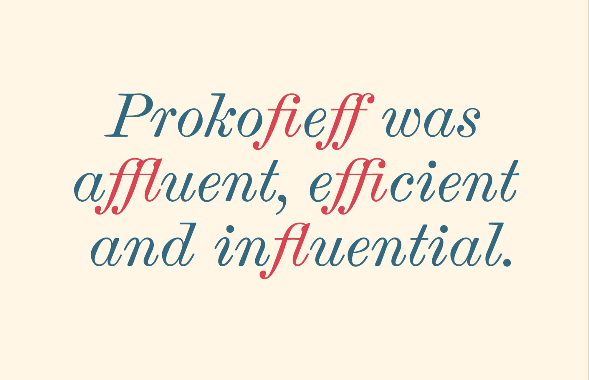
I am afflicted by a fierce affection for f-ligatures. Featuring a variety of fonts, this was more awareness project than promotion for a particular typeface. It began as a static specimen, but as the subject was Prokofiev, I decided to add music, so it became an animation; and then I blogged about making the animation, and then came the video of me talking about making the animation. That might seem a bit much, embellishing such a short and simple piece with “The Making Of…” but social media is all about shortness and behind-the-scenes narrative and talking heads, and animated type specimens are an art form and therefore suitable material for some ’splaining.
“stealing this sentence for my type design workflow lol” —Daedalus @digitalskirts.

8. BEST BLOG
Working the collection. I was almost an academic, but chose art school over university and art history. But still, old things have always fascinated me, which is one reason I’m attracted to type design, in which the past is so relevant to the present. Many of my blog essays are art-historical. I try to use my practical experience in business, as an art director, graphic designer and type designer, in teasing out meaning from the printed artefacts I collect—with great help from Google and, mainly, Wikipedia. It was an absolute delight to come across Harold Wright’s bookplate, so rich in signification, and decode the plot—right down to the 300th anniversary of the print depicted.
9. FAVOURITE FAVOURITE HAT
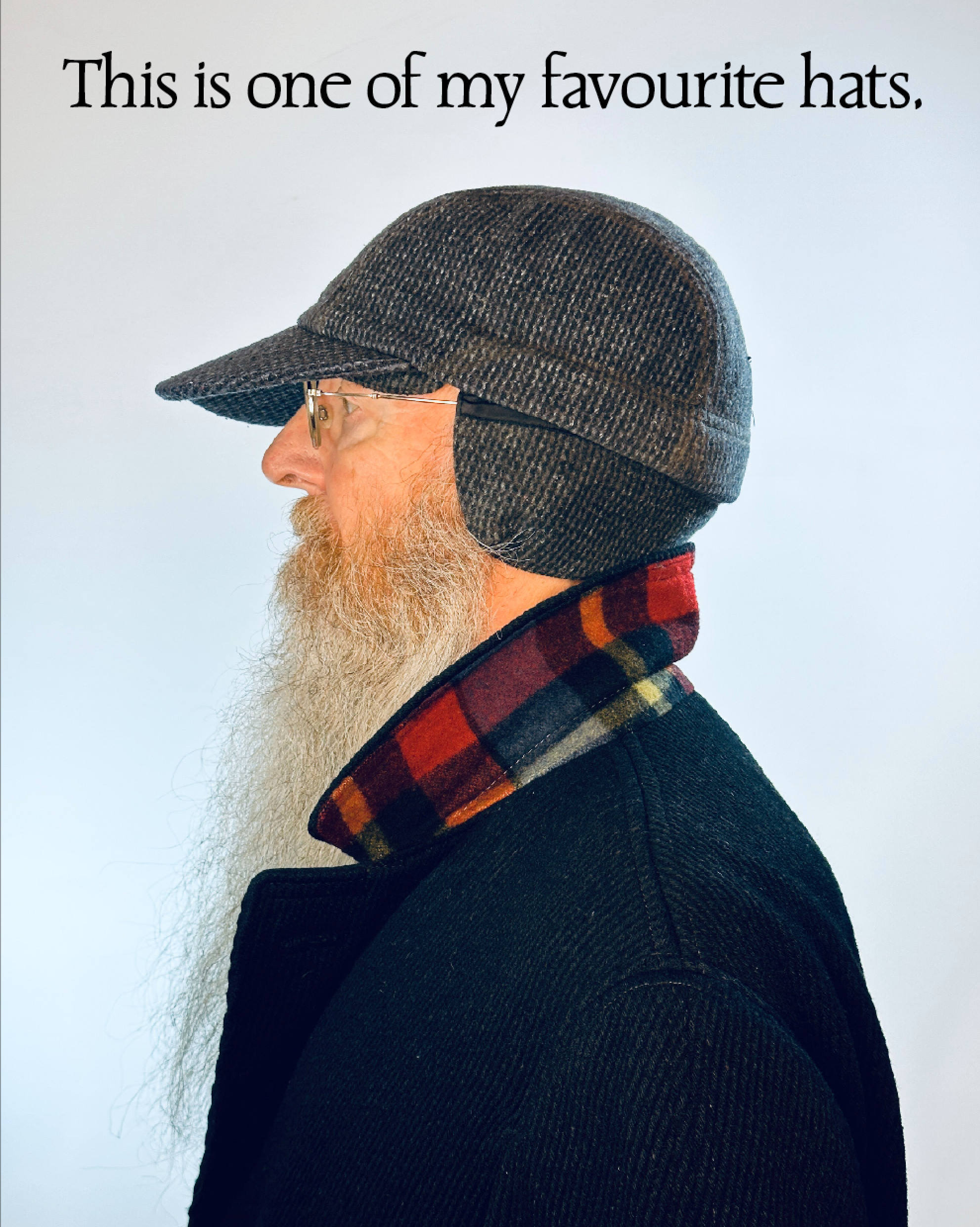
The Tilley Winter Cap. This was well-viewed on Tik-Tok, garnering the Best Comment of the Year, “who is this DIVA [insert purple heart emoji]”—@sleepparalysisdemon11. The Tilley is actually my favourite Favourite Hat post, all very Canadian, matching that cap with my restoration of Carl Dair’s classic typeface.
10. BEST STATIC POST
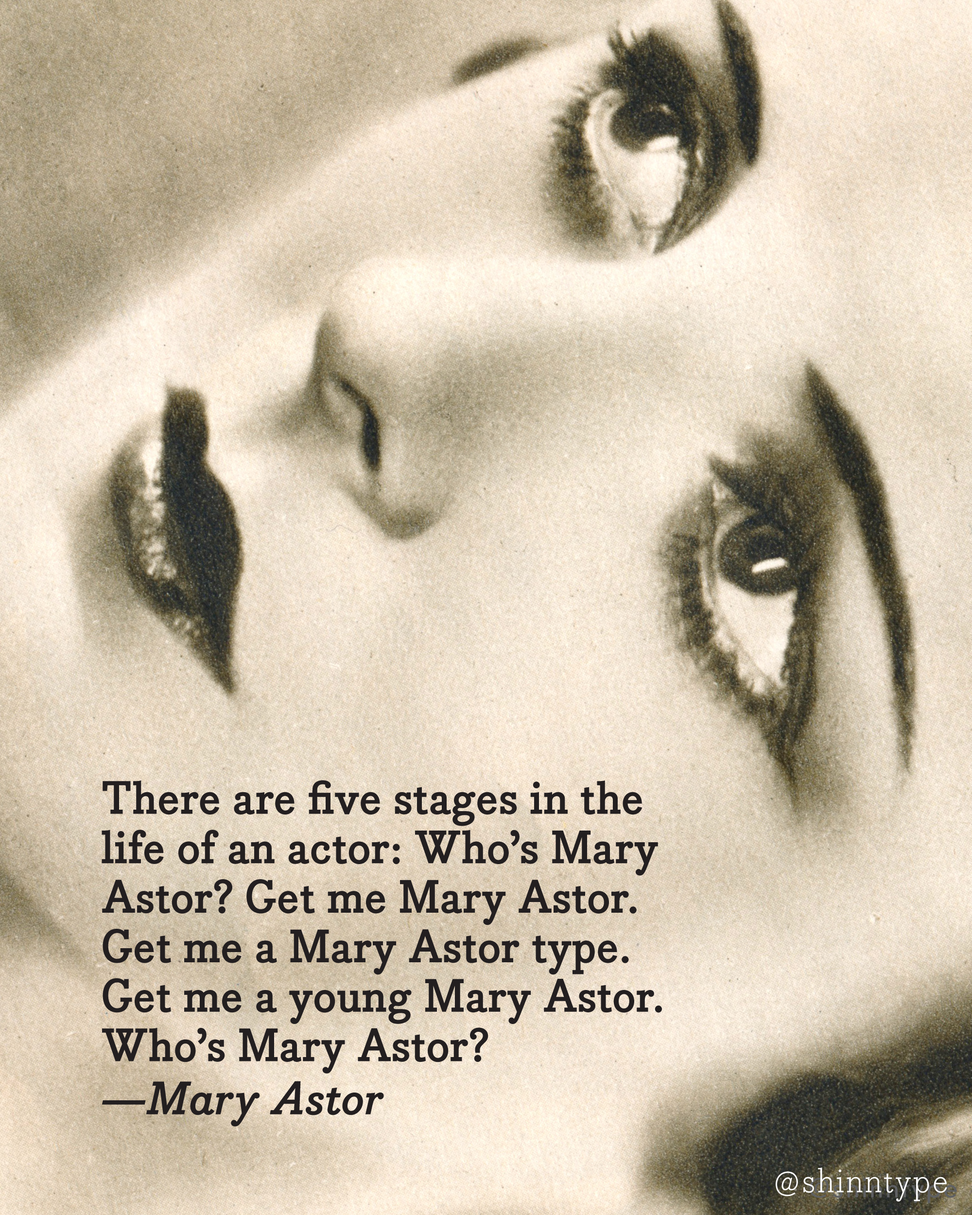
The Actresses: Mary Astor. Moving on from a fixed, type-only layout for the “quote” genre of meme specimen, I created a series of eight posters of varied design, themed around Hollywood movie actresses and their provocative bon mots. The images were curated from vintage movie annuals of the 1930s, 40s and 50s. This picture of Mary Astor from 1931 was shot with orthochromatic film, hence the dark lips and goth effect. There’s also a profuse amount of retouching, and it was beautifully printed by photogravure—the scans blew up real nice, so that I could artfully crop the lady’s face for dramatic effect. If you look at the image blown up to full screen size on a desktop monitor, you can just make out the halftone screen, which must be at least 300 dpi! ?