

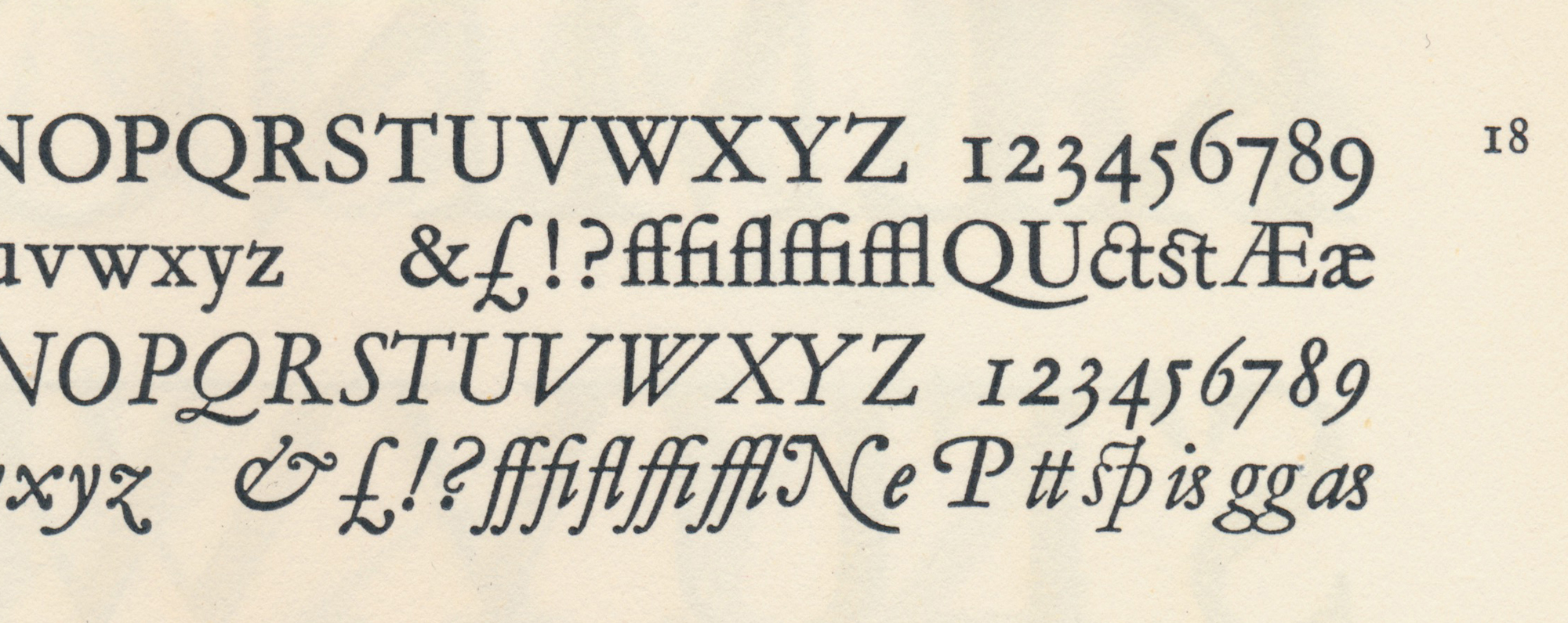
Type Faces for Display, Hazel Watson & Viney, Aylesbury, 1955. The five classic f‑ligatures are shown in Garamond, Mono Series 156. Note also the quaints (ct and st).
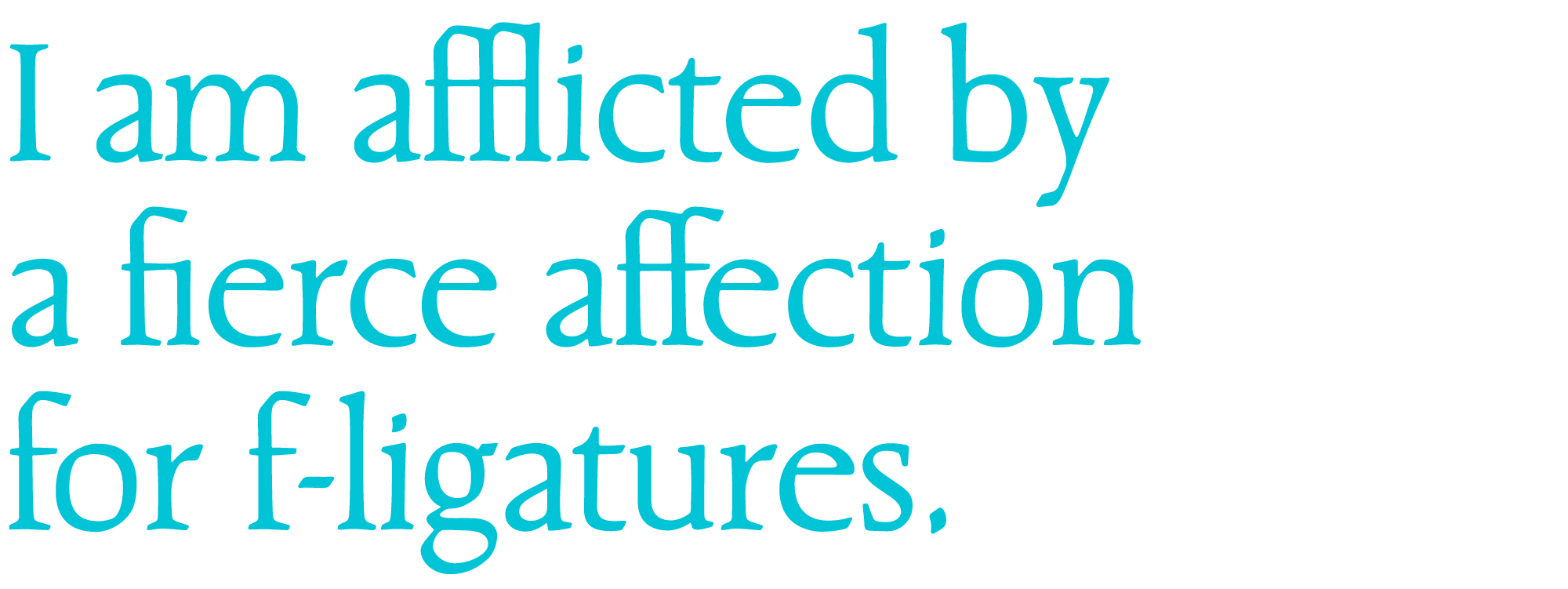
A different kind of pangram
I had thought that Prokofiev was spelled with a “v” at the end, but recently came across it with a double‑f (Boosey & Hawkes, music publishers). And that was also how he signed his name in the Latin script. Amazing! —a person’s name, containing two of the five classic f‑ligatures!
I’m always on the lookout for ways to demonstrate typeface features concisely, in specimens with coherent text, and the thought immediately occurred that perhaps I could include comrade Prokofieff in a sentence, adding words containing the other three classic f‑ligatures, for the full set of five. A pangram of sorts. And this is what I wrote:
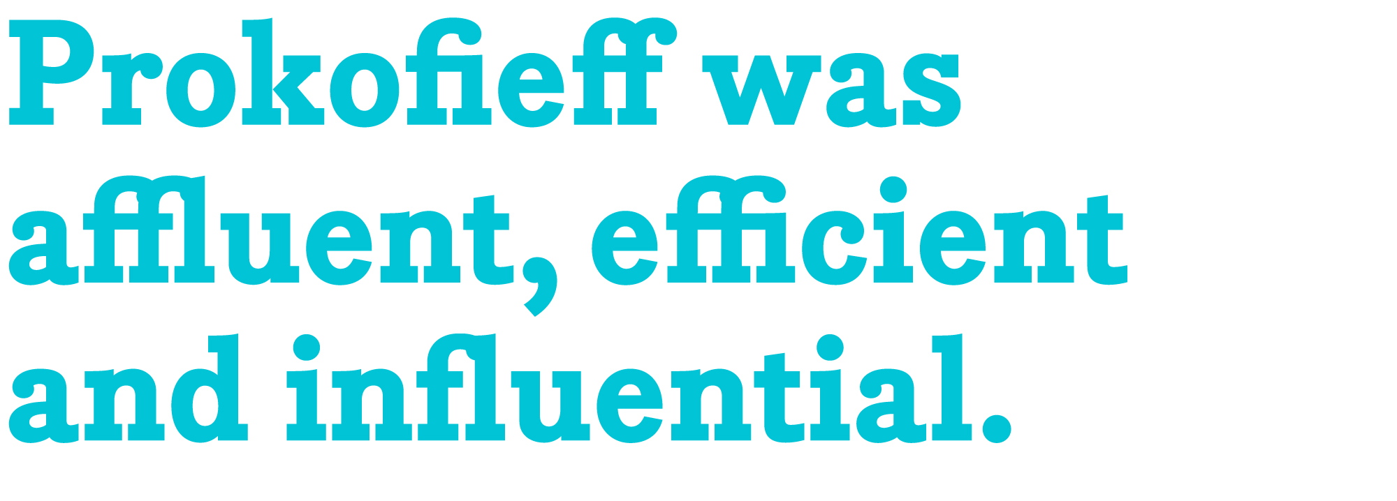
A little research revealed that Sergei Prokofieff (1891–1953) was in fact born into a reasonably wealthy, middle-class family. Clearly the fellow was efficient, judging by the size of his oeuvre. And his influence, as an exponent of modernism—both as performer and composer—is undeniable.
Of course, as Prokofieff was a musician, my specimen would have to be a video, with soundtrack composed and played by the man himself. And that would be wonderful, because random music (i.e. not composed for the visuals in question) always enhances the temporal dynamics of motion, seeming by miraculous coincidence to highlight certain moments.
An animated specimen, to “vertical video” proportions
I’ve made several animated type specimens this year. I like the idea of keeping text and specs consistent while the font changes. The concept is a slide show that gives viewers ample opportunity to focus on the characteristic qualities of each font, by comparing it in overlapped position, with the fonts before and after.
Not all my typeface designs contain f‑ligatures. Beaufort, for instance, lacks them—and was made that way deliberately. I cite Zapf’s Palatino and Optima as precedent. The Pratt fonts, created for a newspaper, have no ligatures because the page layout applications used by newspapers are amongst the most “legacy” of apps, with spotty support of OpenType features.
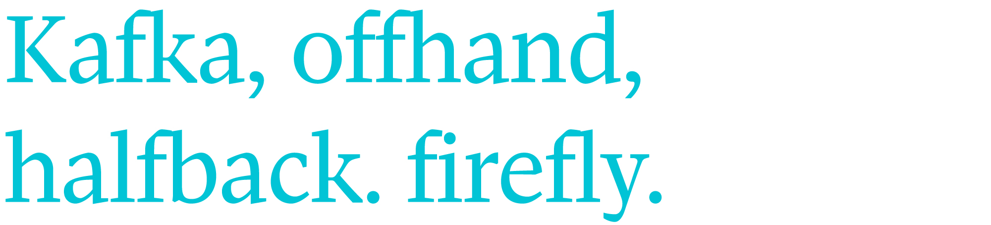
Although it does not have f‑ligatures, the Pratt typeface works acceptably without them. The characters are designed for a “dynamic ligaturing” effect, in which even unusual combinations such as f‑k and f‑f‑h are represented by pseudo-ligatures.
Howarth & Smith’s New Standards for the Printed Word, by Carl Brett, Toronto, 1968. Set in Univers 55.
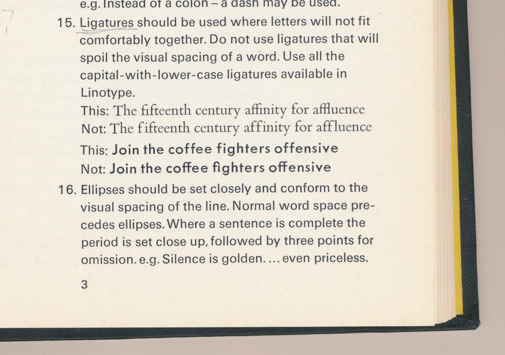 Howarth & Smith’s New Standards for the Printed Word, by Carl Brett, Toronto, 1968. Set in Univers 55.
Carl Brett deemed ligatures appropriate for Bembo, but not Futura. Likewise, I don’t create f‑ligatures for sans serif fonts, such as Neology, which is the typeface used here at the Shinntype site.
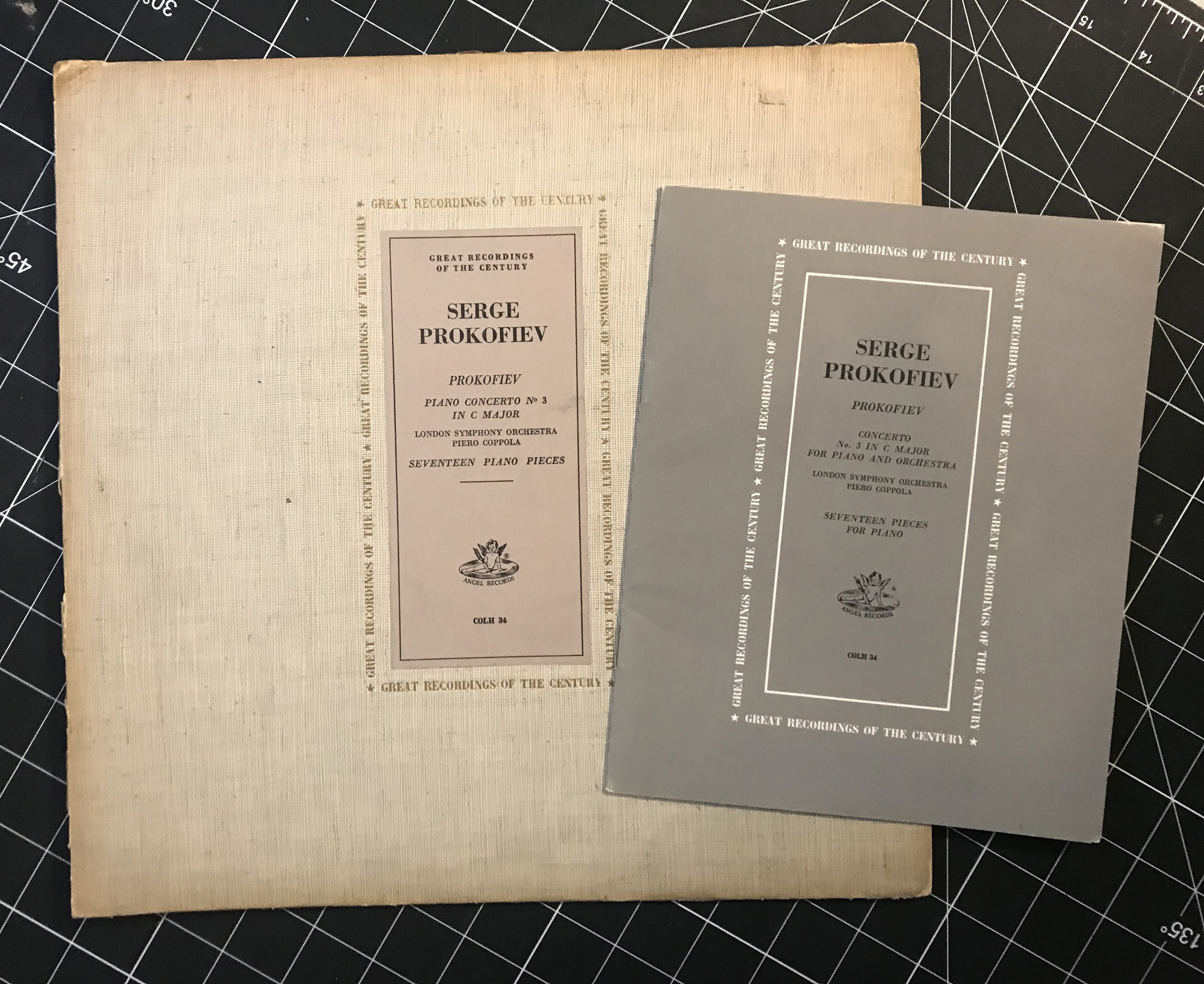
Piano Concerto No. 3, Seventeen Piano Pieces, Serge Prokofiev, Angel Records, 1958. The 12” sleeve is gold foil stamped on fabric-covered card stock with title plate on coloured paper; the booklet is printed black and grey on uncoated stock. Typeface: Bodoni.
Unmute this
But which particular Prokofieff work should accompany my video? Well, there is an Angel album of him playing his own compositions, on the piano, recorded in Paris in 1935. Side One is the Piano Concerto #3, and Side Two a collection of 17 piano pieces, the shortest of which, Gavotte #3, (83 seconds) is the perfect soundtrack, a gentle, lyrical piece with enough repetition to suit six fonts, each having five frames: