
IN PRAISE OF NOSTALGIA
It’s a strategy that’s served me well.
I was astounded by Mark Carney’s speech at the World Economic Forum in Davos. It gave me the kind of chills usually experienced from witnessing stellar performance in sports or the arts, but rarely in politics. Obama is a fine orator, master of the pregnant pause, but Carney brings the thrill of pace, briskly building complex structures of meaning that manifest and connect ideas that are swirling about the present moment, ideas which one has already sensed, yet without the clarity and coherence that he now provides.
Along the way, he peppers the flow with rhetorical flourishes of compressed significance. “If you’re not at the table, you’re on the menu,” of course, a bit of a cliché, and “Nostalgia is not a strategy.” Yes!—I know exactly what he means, because he has just described that principle in dry and precise prose: how chaos presides and the previous world order, such as it was, no longer exists and how, despite the “rules-based” stability it assured, we can’t go back. This little sound bite has a disparaging tone, faulting nostalgists for their retreat from present realities, their solace and cold comfort in the past—poor old dears who can’t keep up with the modern world.
 The Auld English font, 2025: created with great affection for the 17th century.
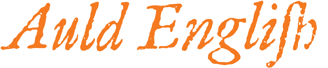 The Auld English font, 2025: created with great affection for the 17th century.
And here am I, a Luddite, aging intellectual railing against new tech, a designer with a lifelong career of history-mining, an inveterate collector of antiquities in print, vinyl, fabric and ceramics, and recent author of the Auld English typeface: a nostalgist if ever there was one.
Carney’s nostalgia is a figure of speech, relevant in the context of the WEF at Davos, but it is not my nostalgia. I relish the art that has ceased to be practised, out of an intense curiosity for its exotic strangeness. Good riddance to the old economic order, but old artefacts are different, being physical conveyances of extinct virtuosity, and for that very reason full of persistent, sustainable wonder.
With my hankering for exotica, why then am I not interested in the faraway cultures of today, Japan, for instance? I suspect it’s because there are relatively few points of contact with my Western, anglophone environment, especially in a way that can be placed in a timeline. I’m someone who prefers that the tracks on a Greatest Hits album be arranged in chronological order. When you can place a work of art at a particular time and place, then you can trace the passage of influence and ideas, the relationship between technology and expression, the interplay of media and culture, discern the arc of an artist’s life, connect all the dots and amass big histories for the libraries of the mind.
Hollywood publicity shots, 8” x 10” glossies (20.3 x 25.4 cm), mid-20th century. James Dean, Marlene Dietrich, Humphrey Bogart, Tallulah Bankhead, Rita Hayworth, Bette Davis.
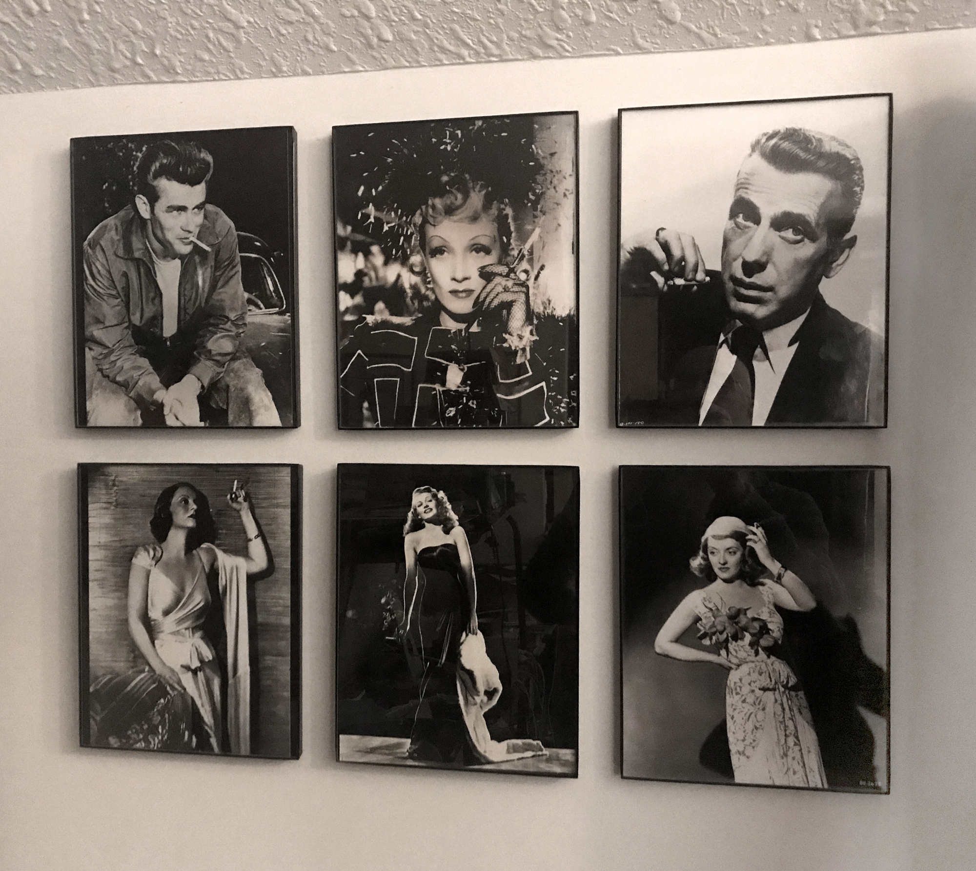 Hollywood publicity shots, 8” x 10” glossies (20.3 x 25.4 cm), mid-20th century. James Dean, Marlene Dietrich, Humphrey Bogart, Tallulah Bankhead, Rita Hayworth, Bette Davis.
Thank you, nostalgia
I met Karey in 1974, when Art Deco and the 1930s were the retro vogue (think BIBA), and we bonded over old films in old cinemas. Today, we have a subscription to Turner Channel Movies and watch a Golden Age Hollywood movie most nights, at home, on a big flat-screen TV.
When she was at the Chelsea School of Art, Karey would frequent the National Film Theatre, and acquired a number of 8” x 10” glossies of actors, from the British Film Institute. At the time, one could order a contact print from its collection of negatives. Those shown here, hung in the Shinnstitute library, were curated for a project on smoking. And it’s one of these that I’m featuring in the latest of my ongoing series of Actresses posters for social media.
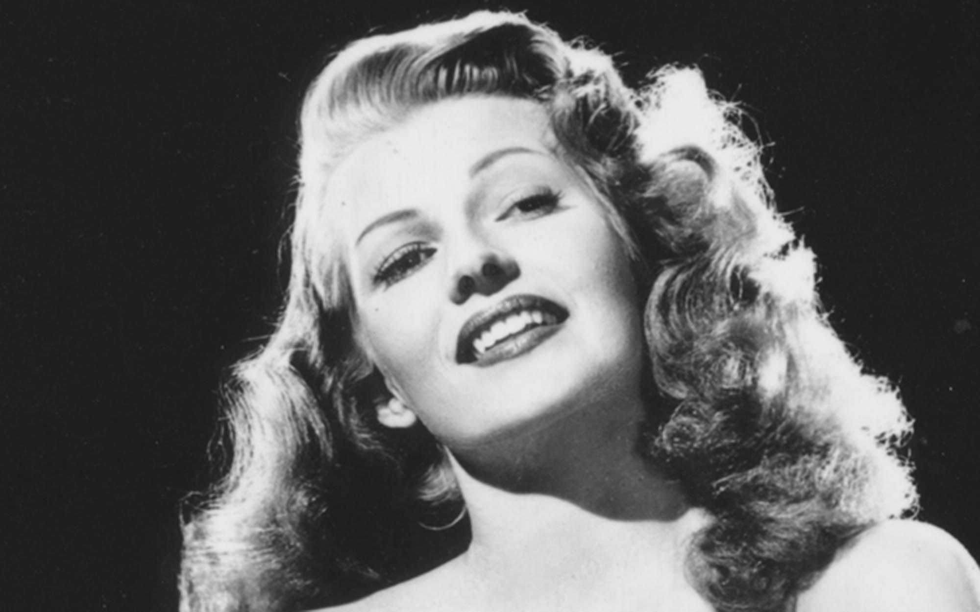
Rita Hayworth, by Rob Coburn, 1946. Contact print from retouched negative, 8” x 10” (20.3 x 25.4 cm).
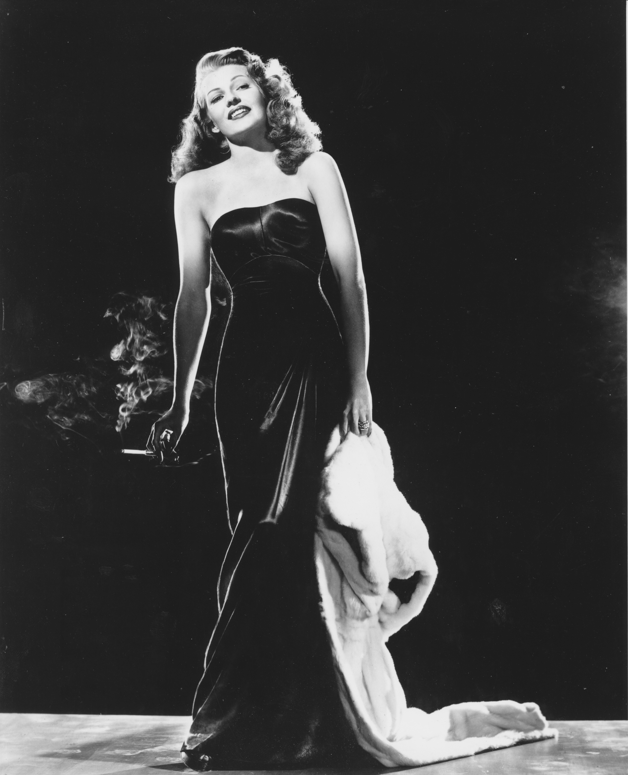
Rita Hayworth as Gilda
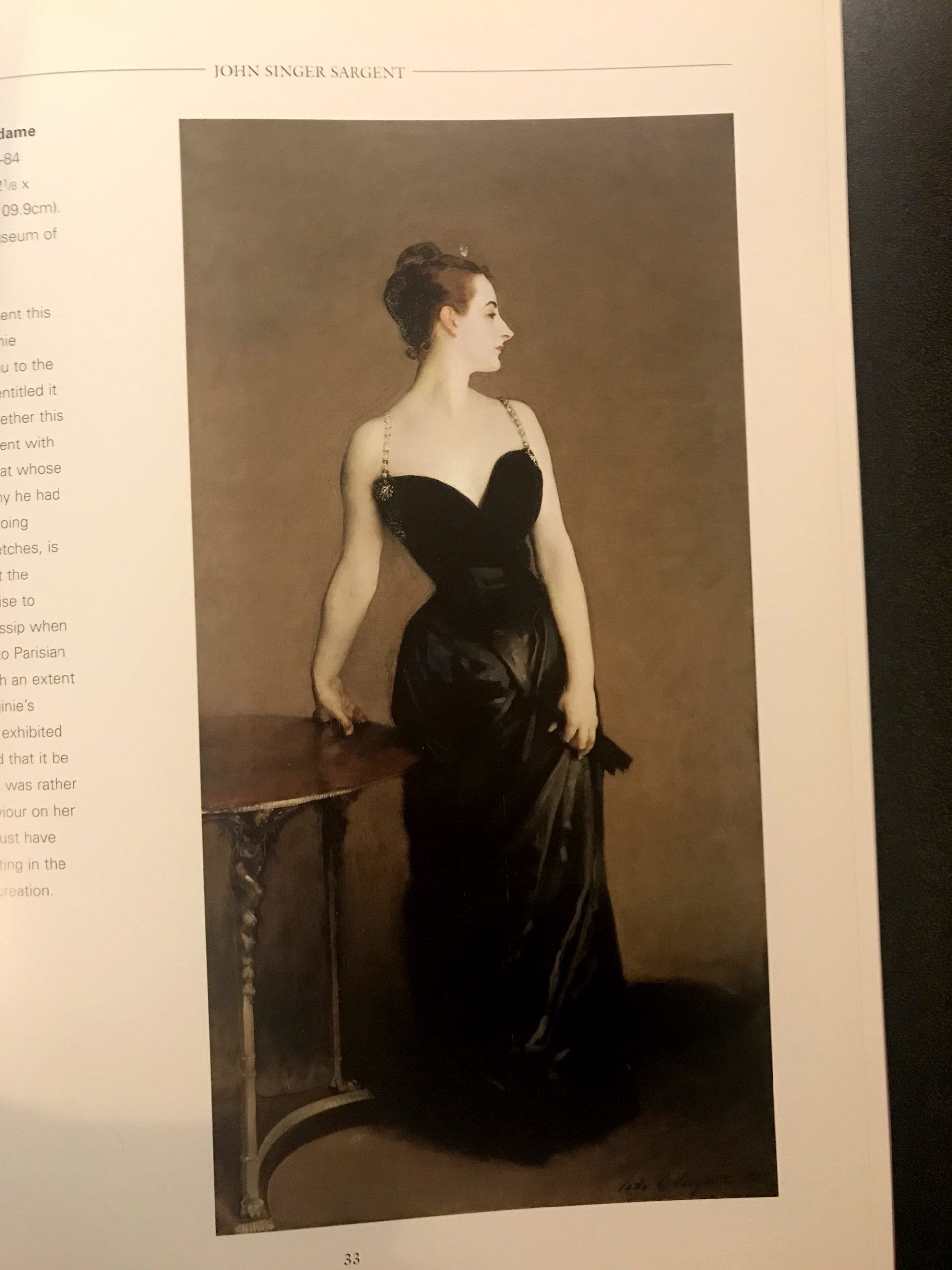
This shot was made by Columbia Pictures stills photographer Robert Coburn, to publicize Gilda in 1946. As was customary, the negative was 8” x 10,” which was a good size for retouching, as was also customary. If you look closely at my poster (below), you can see the work done on Rita’s waistline, slimming, curving and highlighting, which was not entirely necessary, as she was a dancer in great shape, but that’s what they did. The dress is the strapless black satin item she wore in the iconic Put the Blame on Me number choreographed by Jack Cole. Costume designer Jean Louis took his cue from John Singer Sargent’s Madame X portrait of 1883-4. That painting had created a scandal in Paris, with the strap on subject Virginie Gautreau’s right shoulder slipped down along her arm (subsequently re-painted by Sargent in the upright position), suggestive of dénouement, and later inspiring Jean Louis for Hayworth’s cinematic striptease.
Madame X, by John Singer Sargent, 1883–4.
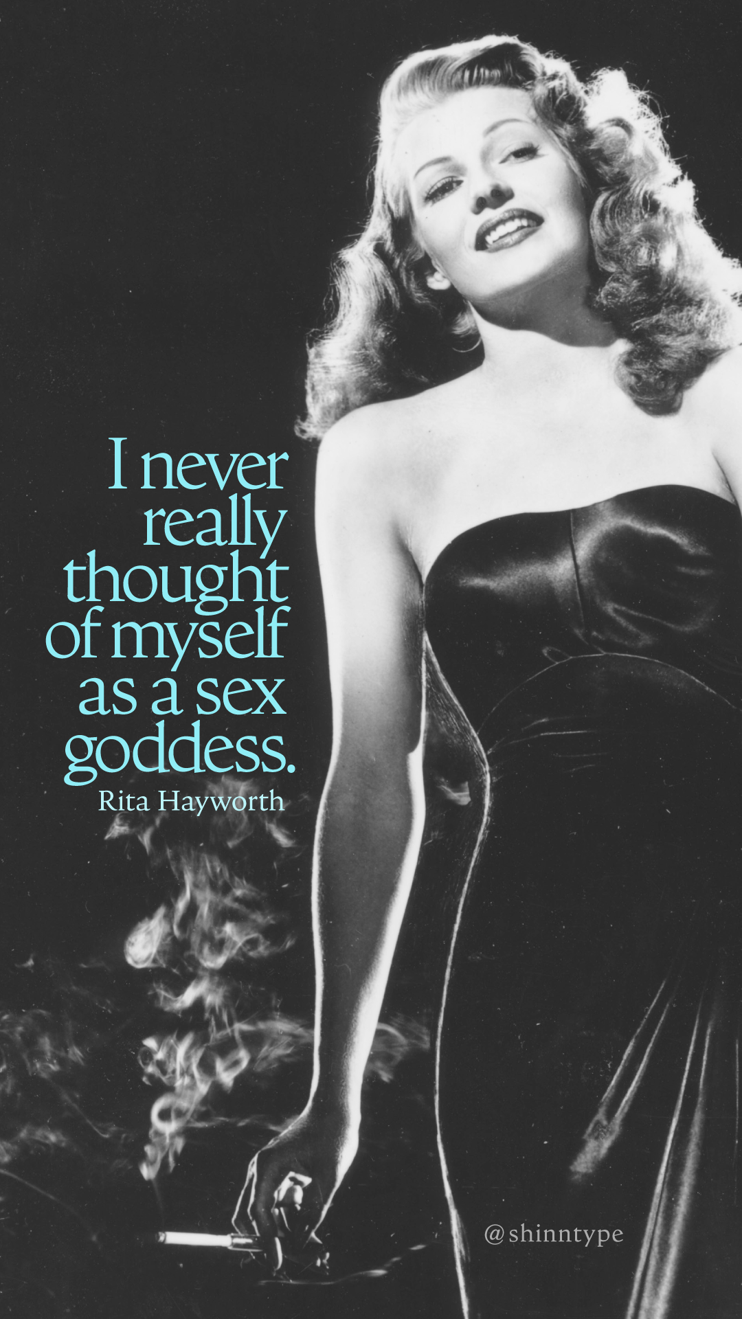
Actresses: Rita, by Nick Shinn, 2026. 1080px x 1920px. Fonts: Nicholas/Goodchild.
The images in the Actresses series are scanned from finely printed vintage material, so that it may be blown up and cropped in interesting ways, without loss of detail. There’s plenty of asymmetric, modernist tension in the layouts, which is something I learned from my mentor Raymond Lee in 1980, when I was 28. That was how he combined image and type in advertisements and brochures. Ray imparted a quality of art direction, a style of design, a feeling that I try to put in all my type specimens.
This particular poster is a paean to that era, the swan song of print, with the Nicholas font automating the “tight but not touching” style of manual kerning then prevalent, the line-spacing drastically reduced, and the text block a graphic element positioned against the shape of the figure, almost as if that were close cropped.
Gilda was a change of direction for Hayworth at age 28 (coincidentally, Sargent was 28 when he painted Madame X ). She had previously featured as a comedienne and dancer, hence the quote. In this film noir she extended her range as an actor, in the process creating a fabulous image of sex and glamour. ●