

FAB EP COVERS OF THE SIXTIES
The scale of the 7” format produced some powerful graphics
The situation in 1963 was dire. I was 11 and couldn’t get enough pop music. There was only one radio station in Britain and it played a mere couple of hours of pop every week—not much on TV either. There was nothing for it but vinyl records, in three formats:
- 7-inch single, price 6s 8d (a third of a £), and that got you one hit song of around two minutes, and a B-side that was, well, a B-side. The disk came in a flimsy generic paper sleeve.
- 12-inch LP (Long Play) albums were better value. For £1 12s 3d (£1.61) there were 30–40 minutes of music, 12–14 tunes, and a sturdy sleeve with a big picture of the artist on the front and a lot of important puffery on the back. But that was many weeks’ allowance/pocket money.
- 7-inch EP (Extended Play). An affordable value, 10-12 minutes of music, four tracks for 11s 6d (58p), and a proper cover, much like an LP. Sometimes, I just couldn‘t wait to buy a single, but abstinence was worthwhile—for instance, I didn’t get any of the tracks on The Beatles Million Sellers as singles, but I bought the EP not long after, four A-sides for less than the price of two singles!
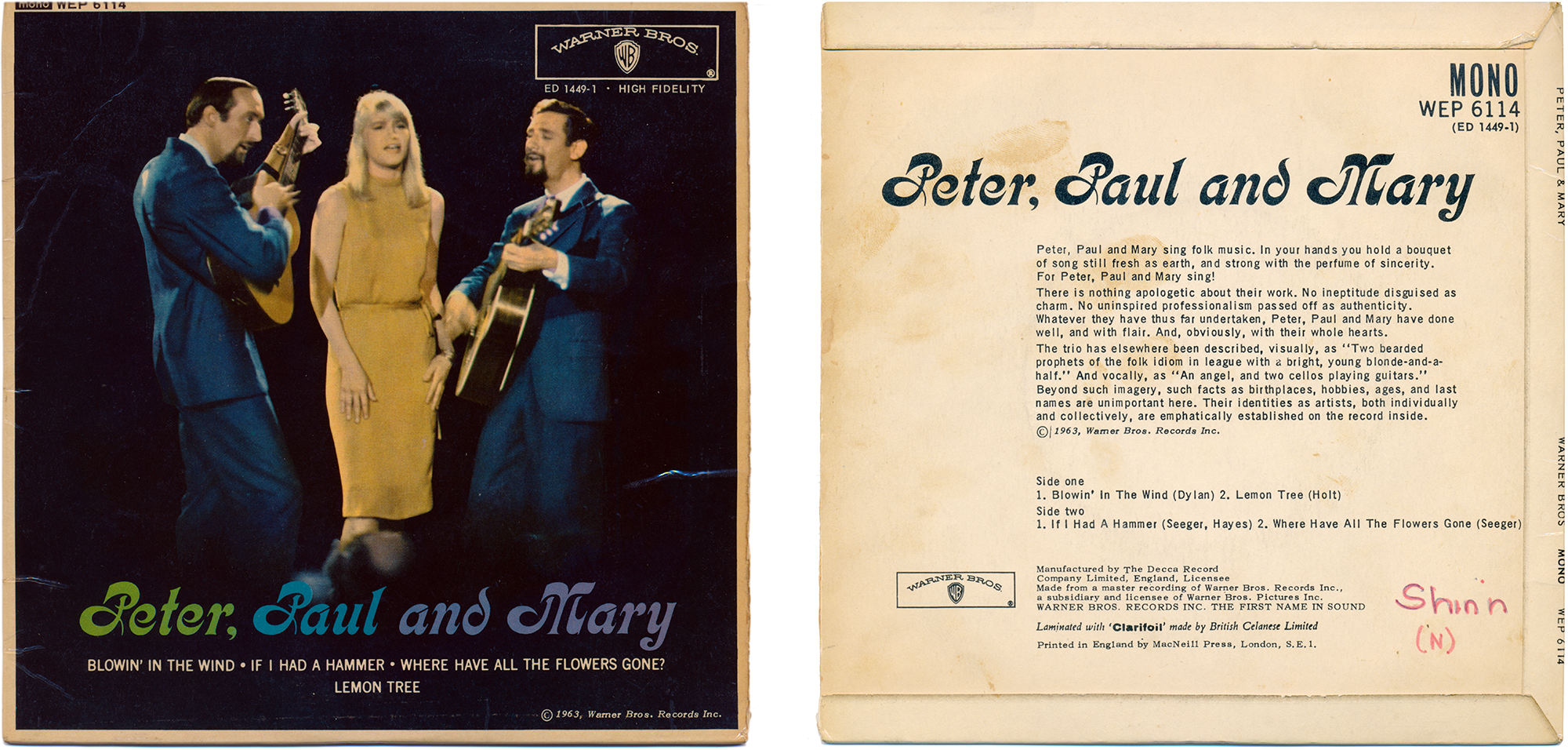
Peter, Paul and Mary [1963]
While other sixties musicians prolonged their careers by keeping pace with fashion, if not setting it, Peter, Paul and Mary remained resolutely on brand. Entrepreneur Albert Grossman, co-organizer of the influential Newport Folk Festival in 1959, conceptualized the group: two bearded beatniks and a blonde, and along with Bob Dylan they took politically charged folk music (protest songs) mainstream. Grossman’s deal with Warner Brothers gave the band creative control of their content and packaging, and they stuck with friend and fellow folkie, graphic designer Milton Glaser, over the years, and his original word mark in the old Art Nouveau typeface Kalligraphia.

The Billy J. Kramer Hits [1963]
Billy J. Kramer had three big hits in 1963, written by his Liverpool friends Paul McCartney and John Lennon of the Beatles. This EP has two of those songs and their B-sides. But Billy didn’t change with the scene like the Beatles did. Already on this EP cover he’s out of time, with the group’s matching suits and short hair, and the bounced, casual typography. Most critically, Billy’s “image” is doomed, representing the sanitized pop music that rock ’n’ roll had become—good clean fun for conservative teens.
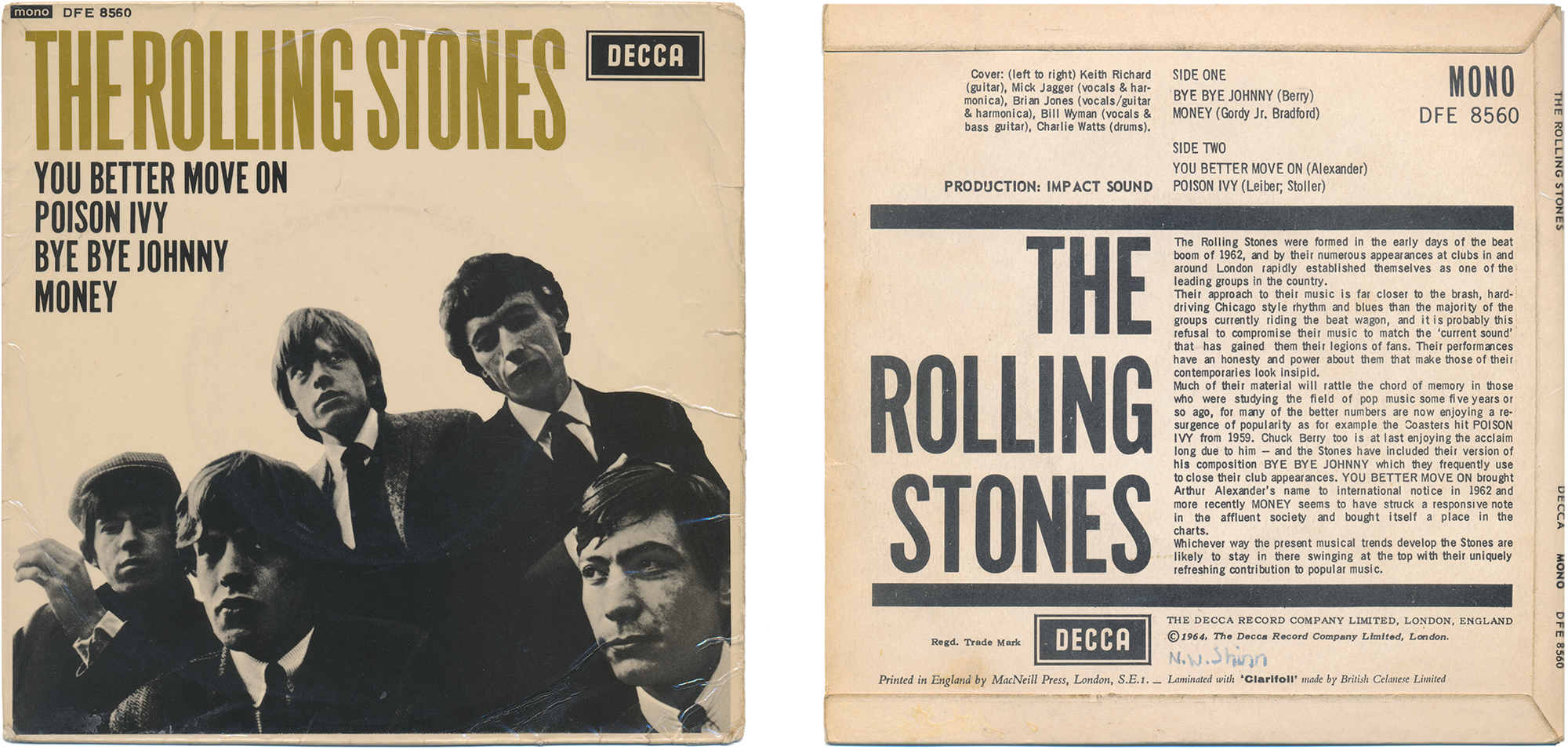
The Rolling Stones [1964]
Now everyone in the group has their own style, and it’s edgy, serious. Close cropped, the picture has become graphic, part of the diagonal tension of the layout. The compressed type is forceful, as in a contemporary concert poster. The photo is nicely trimmed, wider than the border grid suggested by the type and logo alignment, but no bleed.
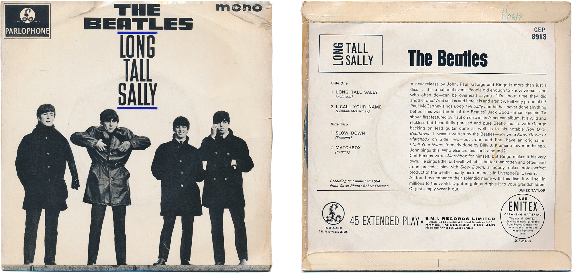
Long Tall Sally [1964]
Photo and design by Robert Freeman, who shot the covers for five Beatles albums during the heyday of Beatlemania. It’s not too big a step from these low angle, long lens, close cropped figures to Help! George is wearing a black leather jacket he bought in Hamburg in 1962.
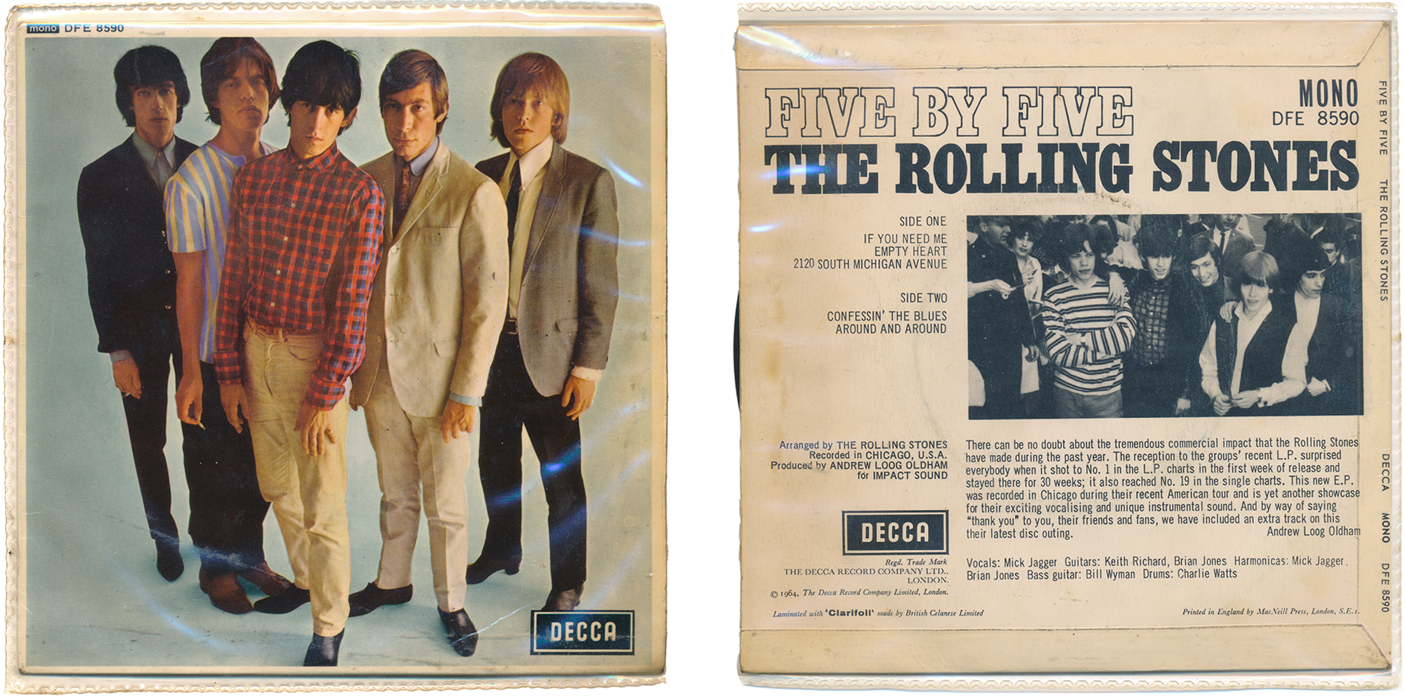
Five by Five [1964]
Like their first album, this front cover has, with daring arrogance, no text (besides in the record company logo). Just the photo of the band in mod togs, against a pale blue infinity cove background. Photographer unknown, perhaps David Bailey.
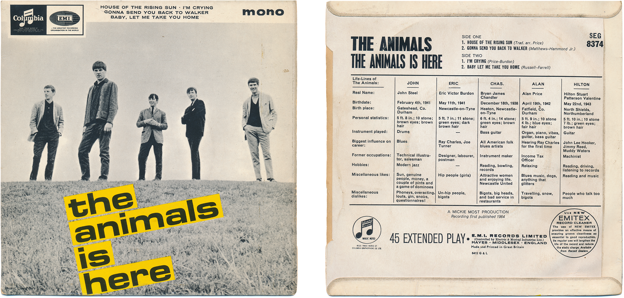
The Animals is Here [1964]
Now that’s a layout! One can imagine the designer thinking “I can do something with this shot,” and playing around on their drawing board with strips of Eurostile Bold Extended (1962) until the pattern of silhouettes, grass and type fell into place.
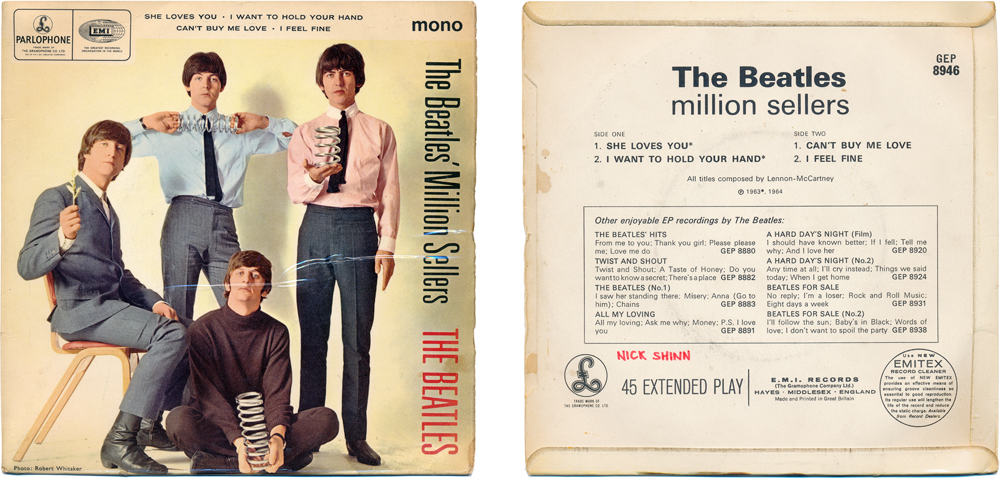
The Beatles’ Million Sellers [1965]
These sharp dressed men look very much the millionaires they had become, in Robert Whitaker’s stagey grey and pastels shot. Modernists, indeed—the term for smart suited jazz fans in the 1950s, that came to identify the clean-cut Mod movement in the mid 1960s. Note how the condensed type of the title (Univers 49), rotated 90°, echoes the coiled springs in the photograph. That’s Univers on the verso, too.
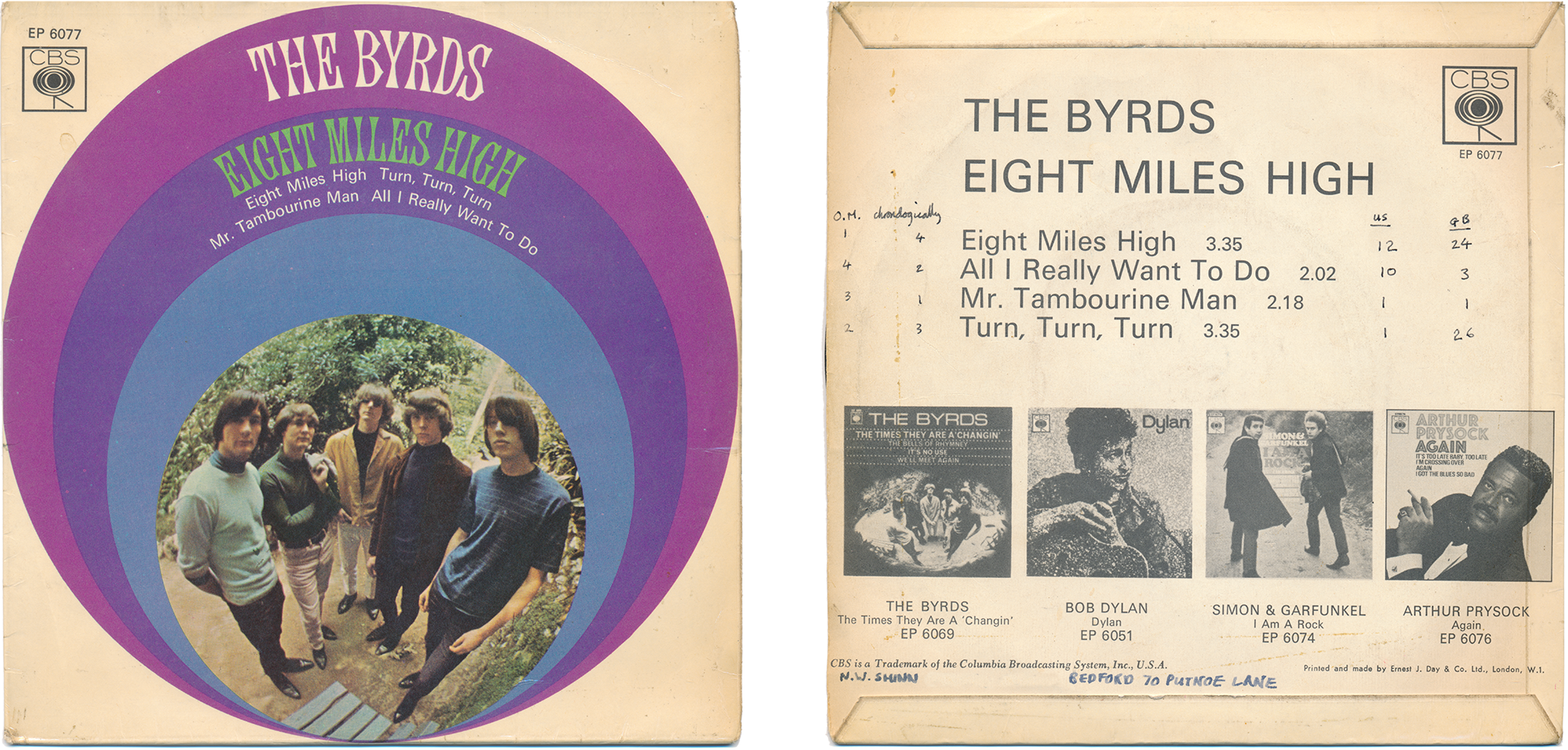
Eight Miles High [1966]
To my enquiring mind, pop music was history and mystery: Where did it come from? Where was it going? Clearly, it thrived on novelty, and I was ever on the lookout for the next big weird and wonderful thing. The progression of guitar sound was critical, from Hank Marvin’s tremolo to Dave Davies’ and Keith Richards’ fuzzed-up riffing. Then came Jeff Beck, fusing sitar influence and feedback in early ’66, and Jim McGuinn’s jazzy, psychedelic solos on Eight Miles High, even more tripped out. Equally bizarre, Barry Feinstein’s fish-eye photo of the group, and, why not, a goofy Victorian display type?! For trivia, I recorded chronology of the tracks, US and UK top chart position, and my ranking of the four A‑sides.
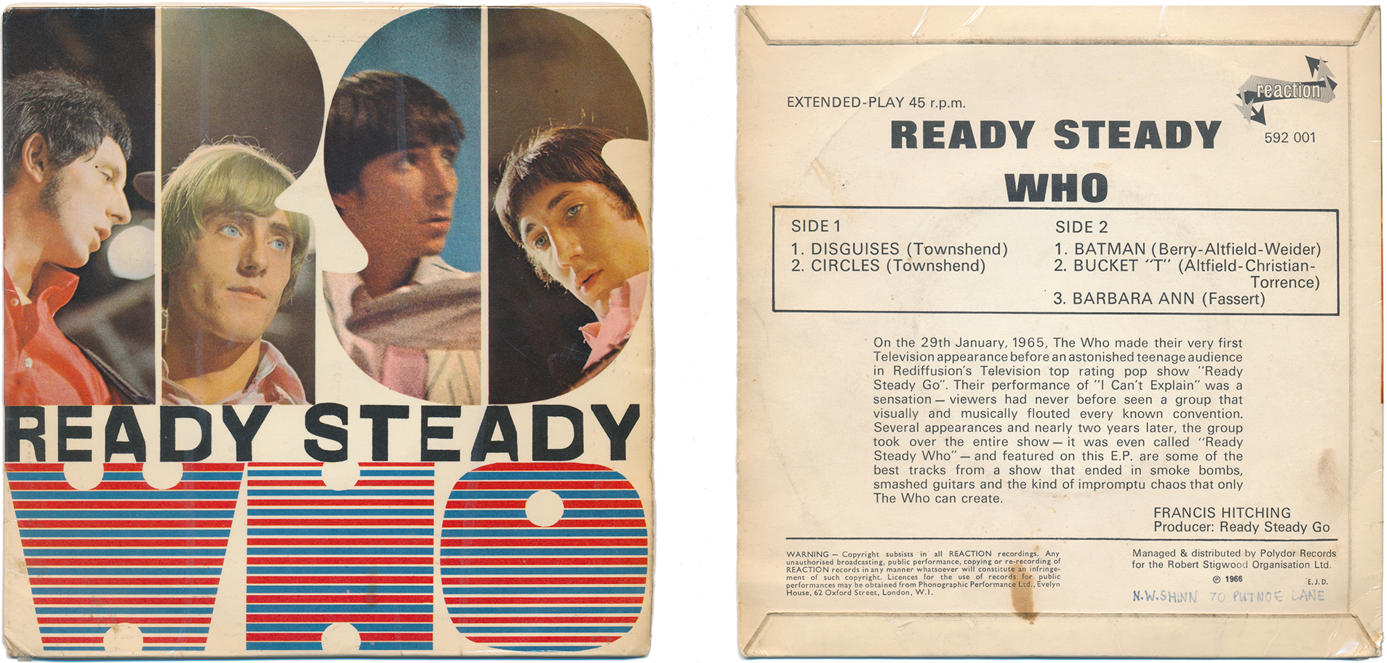
Ready Steady Who [1966]
An odds-and-ends assortment, one side comprising two artful Pete Townshend compositions with unusual arrangements, the other being a hearty piss-take of surf music, as the raw material of pop art. Experimental, then, and with a genius cover design. Twelve years later, having become familiar with pre-press production, I realized how it would have been assembled from black and white artwork with colour instructions on tissue overlays for the film separators, a tour de force in knock-outs and layering. For instance, the stripes began, I presume, as a Ben Day gradient, with the colour distinction made by selective painting out (opaquing) on a size-as negative at the film house.
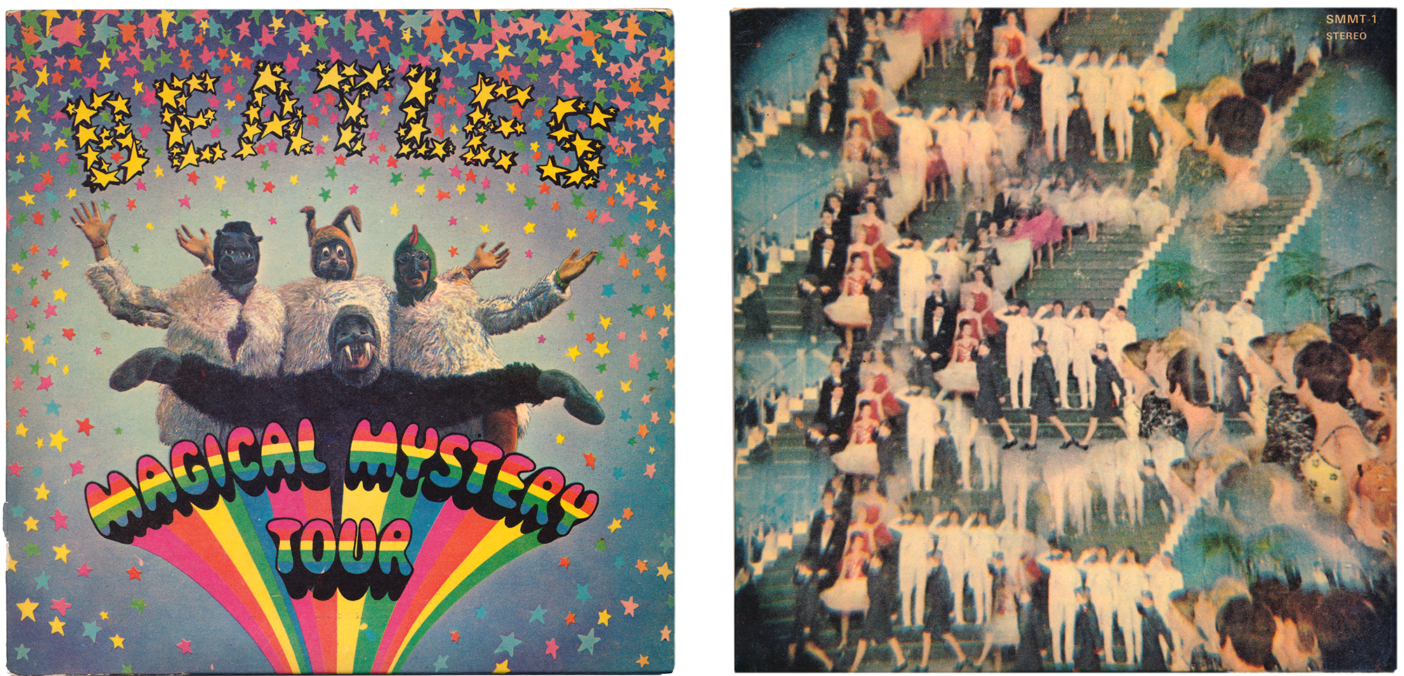
Magical Mystery Tour [1967]
Pop art with hand lettered text. Art and design by Bob Gibson, photo by John Kelly. This was the soundtrack for a TV program and, with six tracks being too short for an album, it was released as a double-EP set, also containing a 32-page picture booklet.
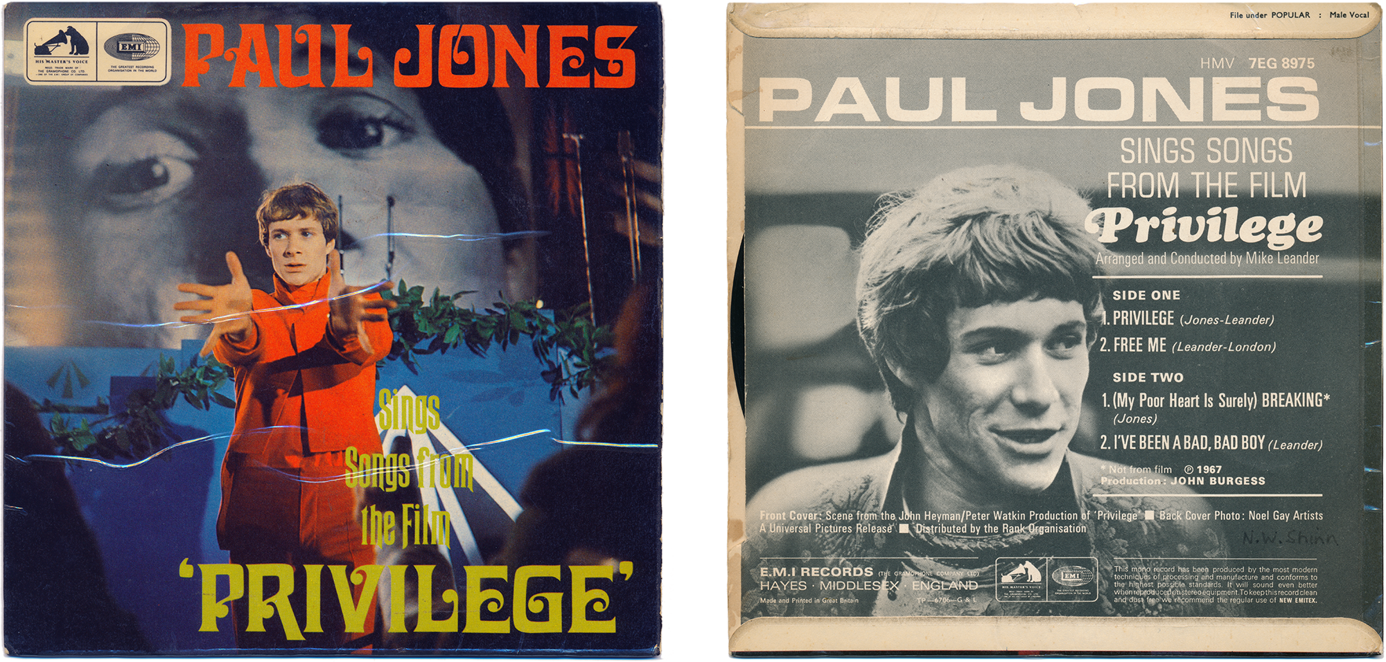
Paul Jones Sings Songs from the Film Privilege [1967]
The typeface is Davida, a neo-Victorian prize winner by Louis Minott, from VGC in 1965. I’m not sure why I bought this, the cover was poorly designed and I was never a fan of the Manfred Mann group (Jones was their lead singer), and the music was a bit square, but there was precious little pop music in movies and the tenor of the time was expansive, so a dystopian science fiction movie about a deified pop star—not to mention supermodel Jean Shrimpton—must have seemed like a good idea. This was before the Who’s Tommy (1969) or David Bowie’s Ziggy Stardust (1972), or for that matter Rollerball (1975), or Stardust (1974), in which Karey and I were extras. ●