
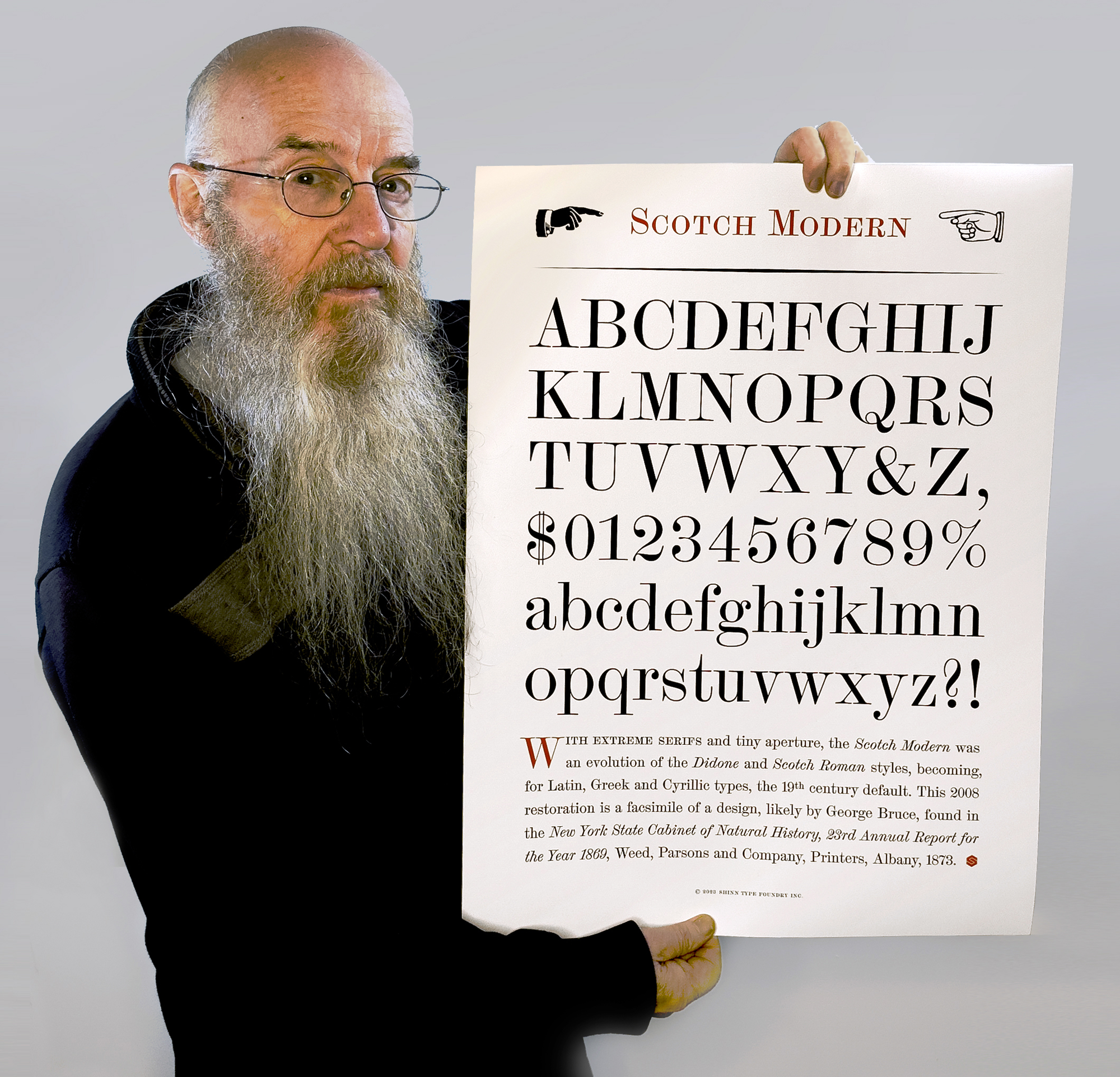
I’ve recently created specimen prints for a dozen of my typefaces, to this format and size (18” x 24”), somewhat in the manner of pages from a traditional foundry specimen book.
THE ART OF THE SPECIMEN
My new work is a series of prints inspired by a passion for old foundry catalogs. In this Q&A, I discuss their typography and the relationship between art and utility
These are very plain posters, why not something more colourful and creative?
Please don’t call them posters. They are fine art prints. Their main purpose is to display the design of the principal characters in a font at a large size, for detailed inspection and comparison with one another. Type specimens. So while posters may promote a product, event or idea, or decorate a wall, these have a slightly different, more utilitarian purpose.
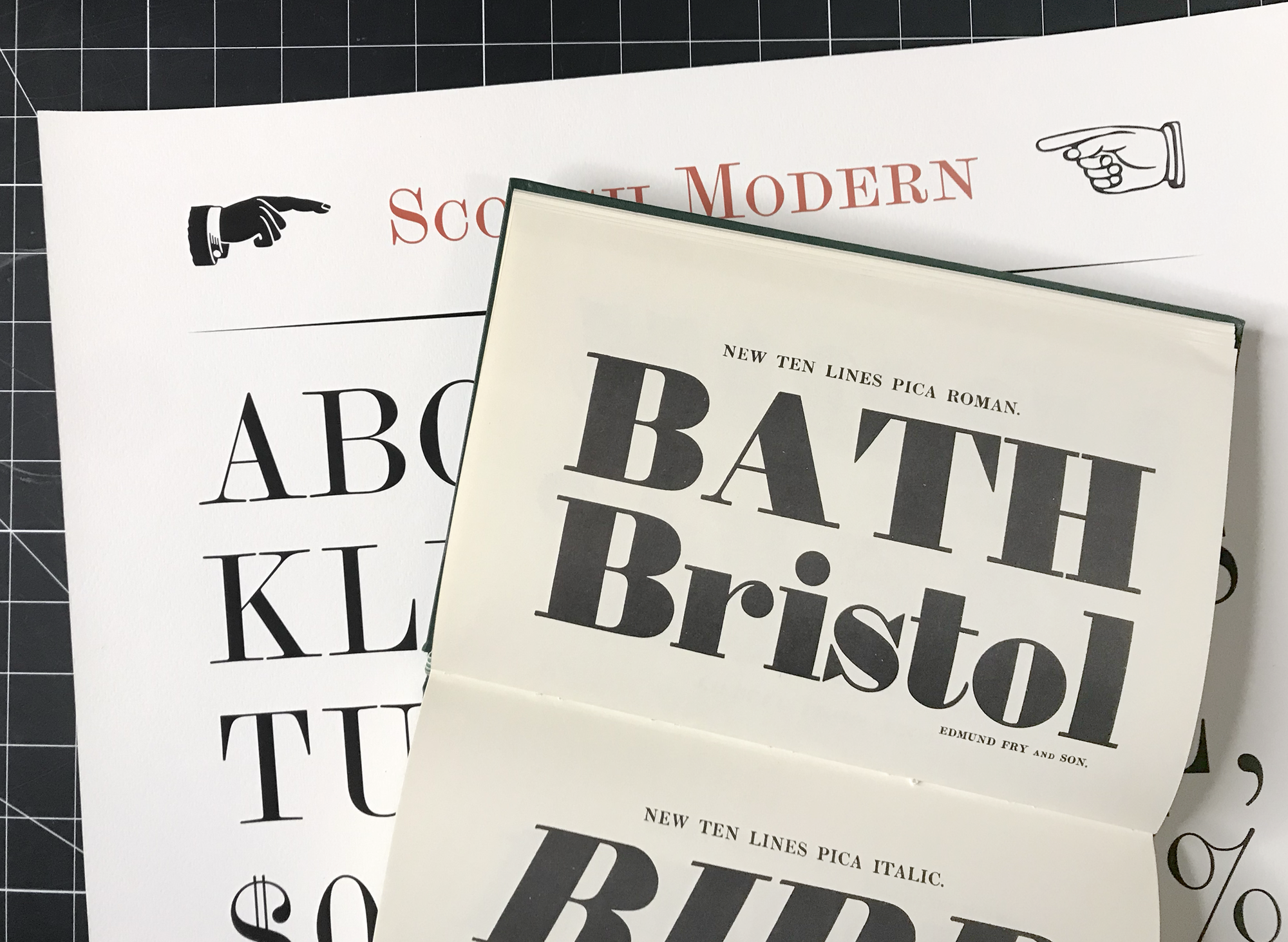 The Shinntype prints display letters at a similar size to the largest fonts in metal-era foundry specimen books, but show the whole alphabet in both upper and lower case, plus numerals. Shown is Edmund Fry’s Specimen, London, 1828.
If they are so functional, why call them fine art?
Because the letter forms themselves are visually aesthetic objects that perform their task—communicating text—solely by being looked at. And because blowing up in size something which is prosaic, routine and practical (here a reference tool normally found as books that are foundry specimens or academic or professional surveys) is a process often employed in conceptual art and pop art: recontextualizing by changing size. A classic example, Roy Lichtenstein’s large paintings in the manner of panels from a comic book. Then again, the prints are also a series, documentation of digital devices, which adds cultural weight. The concept and design is taxonomic and understated. A dry, industrial quality.
Very well, but how would you really put that in artspeak?
My practice centres on the development of liminal entities that straddle the boundaries between art and utility. It is conceptual work which addresses issues of commerce, authorship and technological progress, reaching a worldwide audience via interdisciplinary platforms, where it deconstructs the paradoxical ontology that it both represents and interrogates.
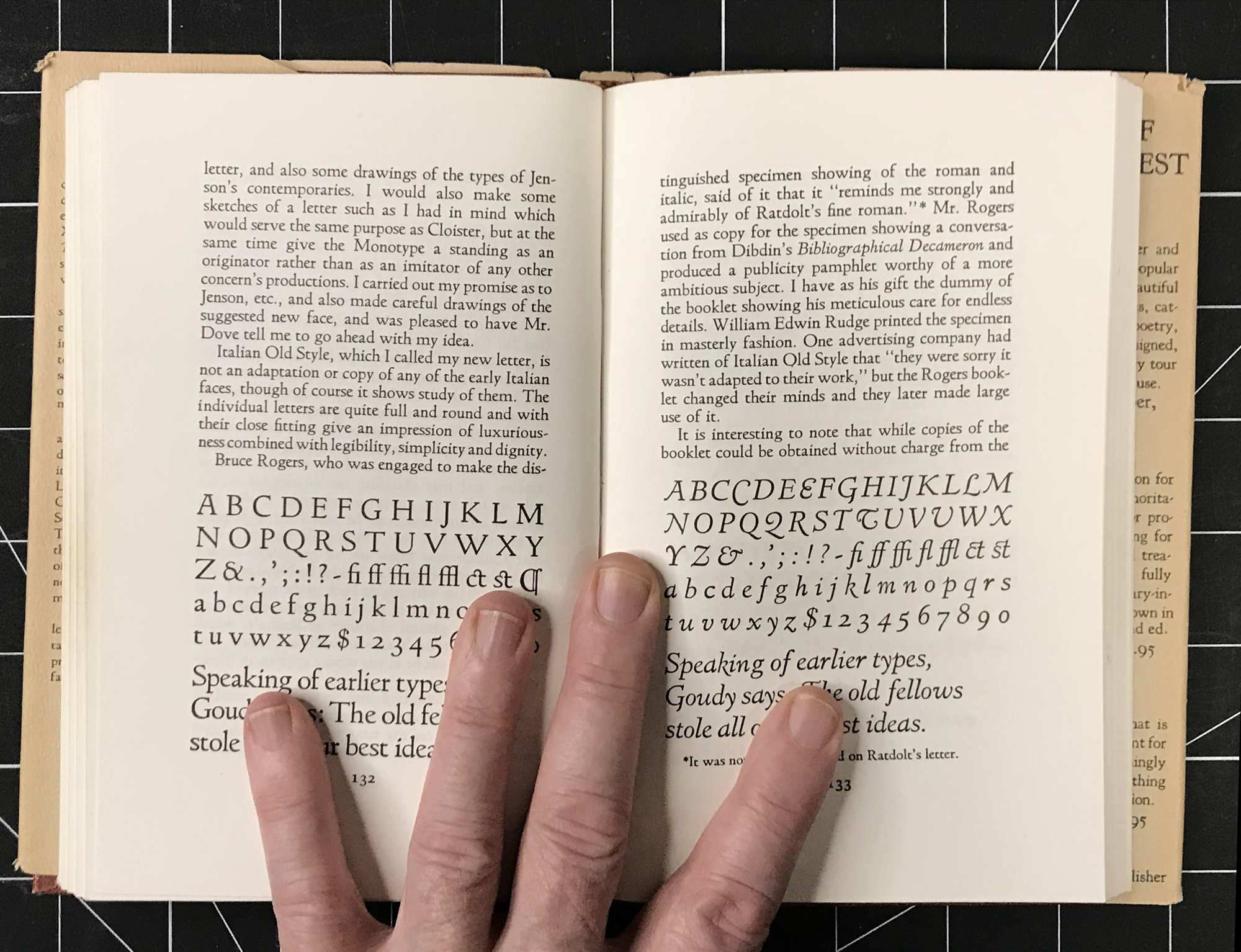 Goudy’s Type Designs – His Story and Specimens, by Frederic W. Goudy, New Rochelle, 1946. These are the two pages of this book in which the body text font used throughout matches the typeface being featured—Italian Old Style.
Which specimen books are your benchmarks?
Goudy’s Type Designs, for instance. It shows types in most of the main Latin characters, and numerals, with descriptive text in justified paragraphs. That’s a practice I’m following. Another is Fraktur mon Amour, which has the fairly typical arrangement of: name/ upper and lower case/ numerals/ paragraph.
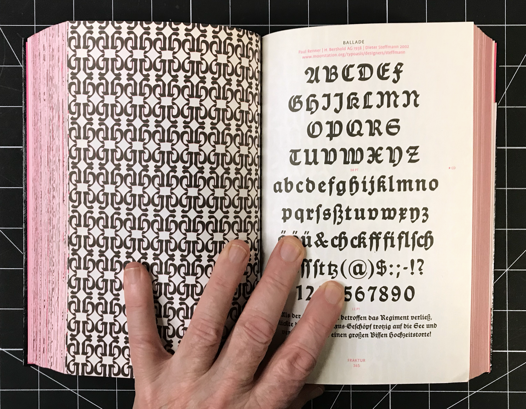 Fraktur mon Amour, Judith Schalansky, New York, 2008.
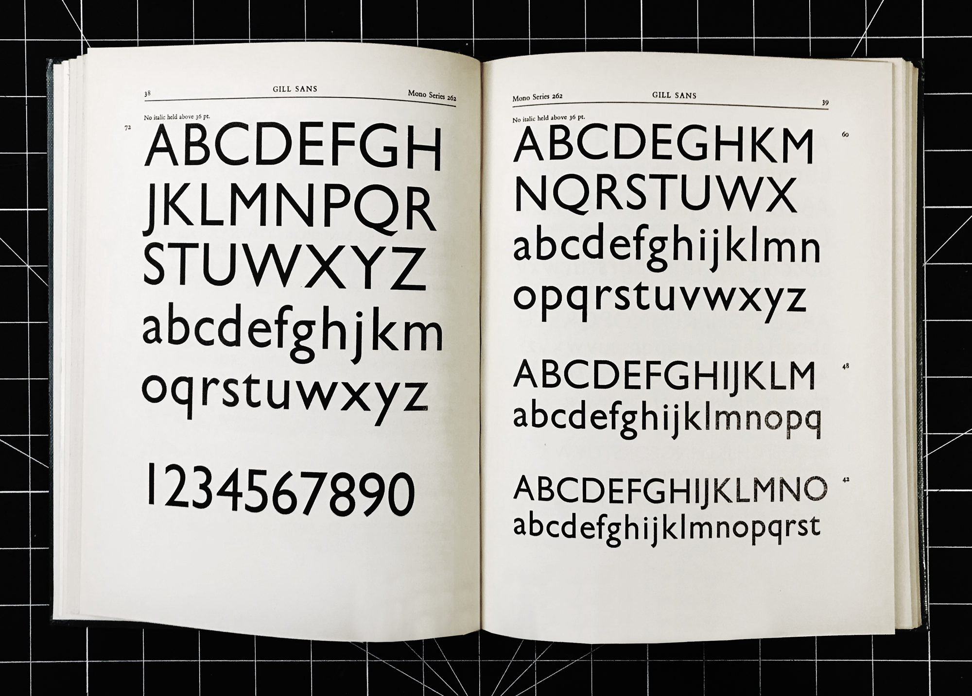 Typefaces for Display, Hazell Watson & Viney, Aylesbury, 1955. The missing letters are oddly poetic.
But your prints are advertisements, are they not?
Masquerading as a product?—of course! Visually, the semantic hierarchy of: headline/ image/ body copy/ signature, with these proportions, is not just the format of catalogs and natural histories. Before the “creative revolution” of the 1960s, it was also the classic no-nonsense formula of magazine advertisement adhered to, mid-century in the USA, by the very influential and successful ad man and author David Ogilvy, for Rolls Royce, Hathaway Shirts, The Man from Schweppes, &c.
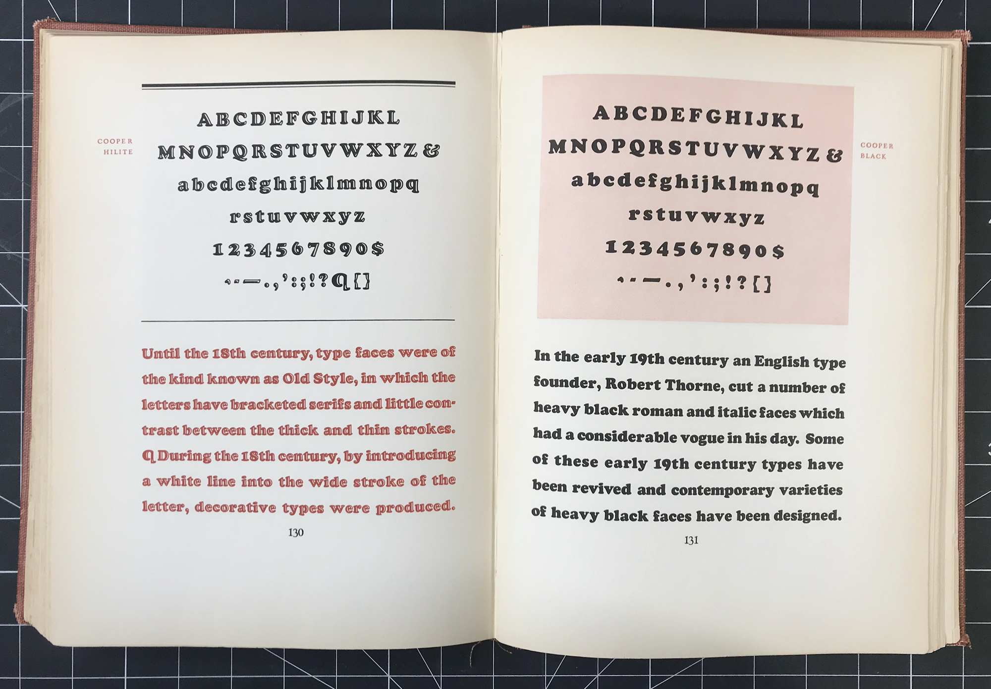 The Book of Oz Cooper, Chicago, 1949.
You’re rather fond of squared off body copy, aren’t you?
I think that comes from my time as an ad agency art director in the 1980s, when we were very precise in text-wrapping around close-cropped images, to the extent of often re-writing copy for better fit. There’s something about the craftsmanship involved in persuading running text fo fit into a shape that makes doing such typography intriguing, like solving a puzzle. Therein lies its appeal to the artisan. Squaring off the whole content of the Scotch Modern and Figgins Sans prints was very satisfying. It also exhibits a quality of professional, high quality finish, reflecting the time, effort and skill that went into it. Besides, there was a distinctive era of early modernism, between the world wars, before the rag-right international style came to the fore, when the purity of text blocks in layouts (no matter how asymmetric) was paramount, when they just had to be perfect rectangles. That was something else again, a plasticism exemplified in the Purism movement.
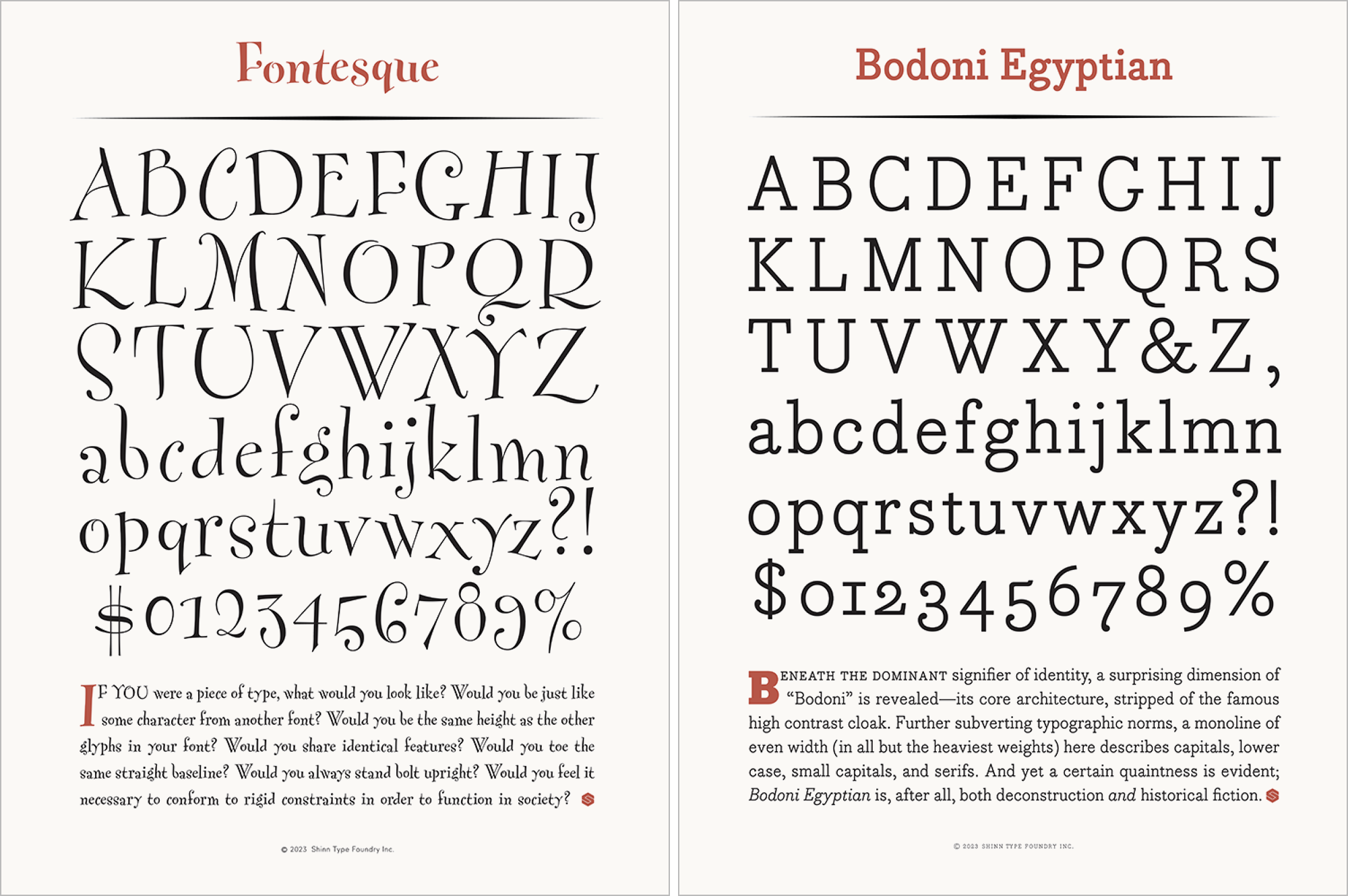 The Fontesque specimen employs three optical sizes of the typeface. The Bodoni Egyptian specimen features the venerable trope of a few words in small caps acting as a buffer between drop cap and upper and lower case body text.
Another traditional typographic affectation is small caps, which you include in a lot of your fonts.
Yes, nine of the types in the print series have small capitals. I used to employ all the bells and whistles of “expert” fonts to animate the editorial matter of newsletters and brochures that I designed in the 1990s, and subsequently gravitated quite naturally to designing fonts for immersive reading in body copy, with features such as small caps and old style figures. In the specimen prints the classic arrangement of a drop cap followed by a few words in small capitals is observed, a transitional phase before the main text begins in upper and lower case. I must confess, obsessing over the intricacies of typography—small caps, alternate figures, arcane ligatures, unusual glyphs and special symbols, widows, orphans and rivers—that’s indulging deeply in the ancient discipline, an obscure zone of knowledge which typographers are wont to inhabit.
Is optical size shown in any of the prints?
Yes. Nicholas, Fontesque and Scotch Modern have size-specific cuts. The display fonts are shown in the big alphabets, the text fonts in the descriptive paragraph, and, for the Scotch, the Micro is used in the copyright notice. ?